Project archive
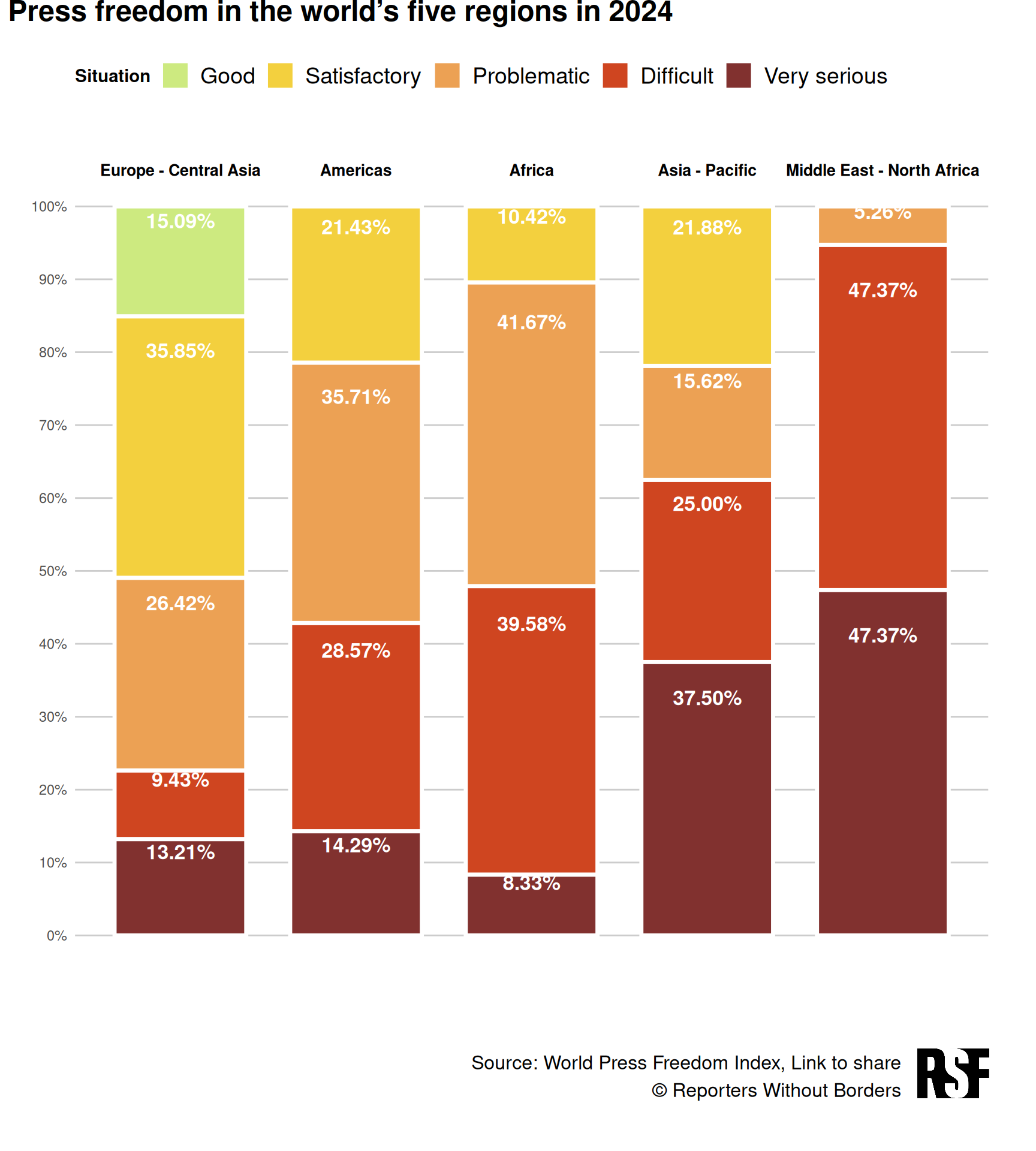
Press Freedom Index 2024
Global ranking of press freedom in each country in 2024, by Reporters without Borders (RSF).
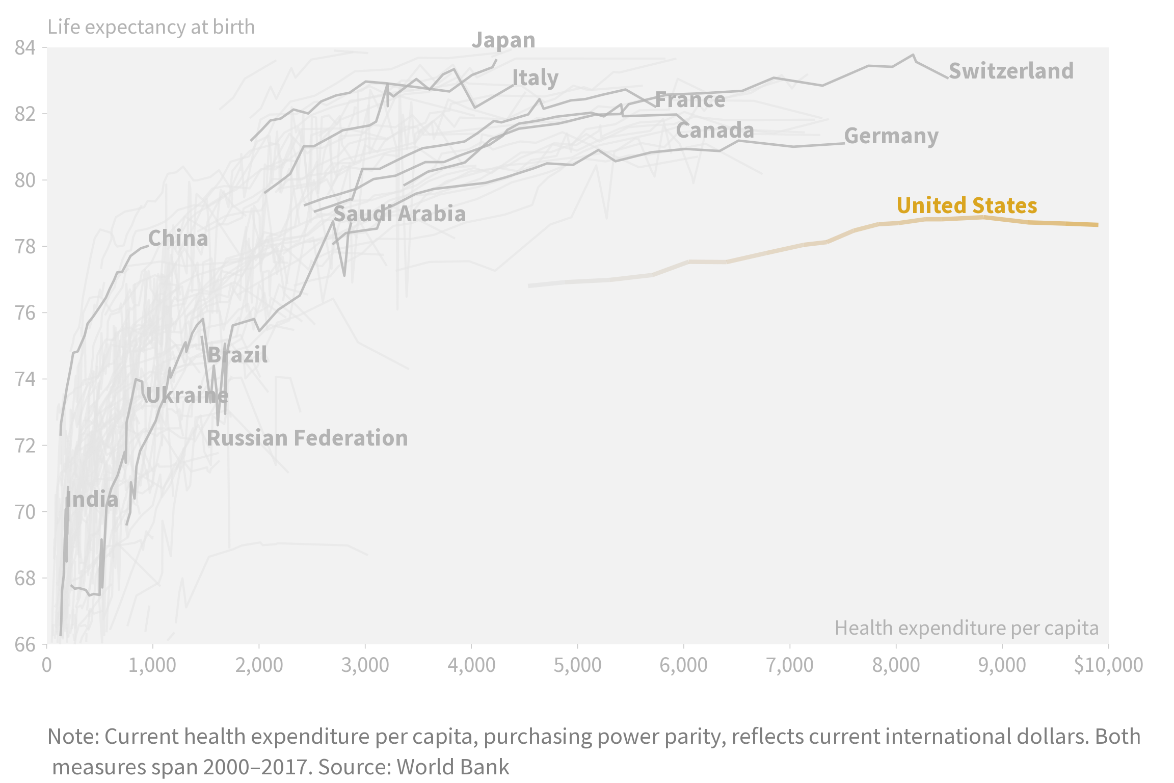
The Price of a Longer Life
An exploration of how health spending correlates with life expectancy across countries from 2000 to 2017, recreated and refined from an original New York Times graphic.
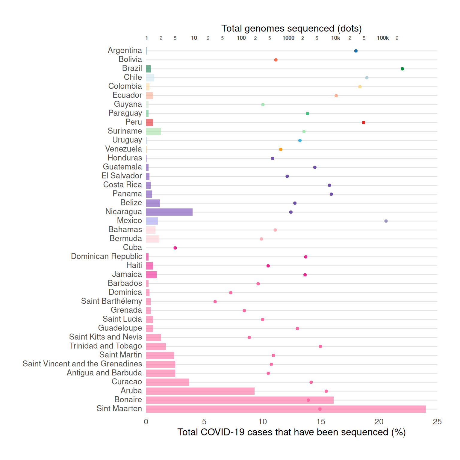
Dispersion patterns of SARS-CoV-2 variants Gamma, Lambda and Mu in Latin America and the Caribbean
The graph illustrates the total number of genomes sequenced alongside the proportion of sequenced COVID-19 cases.
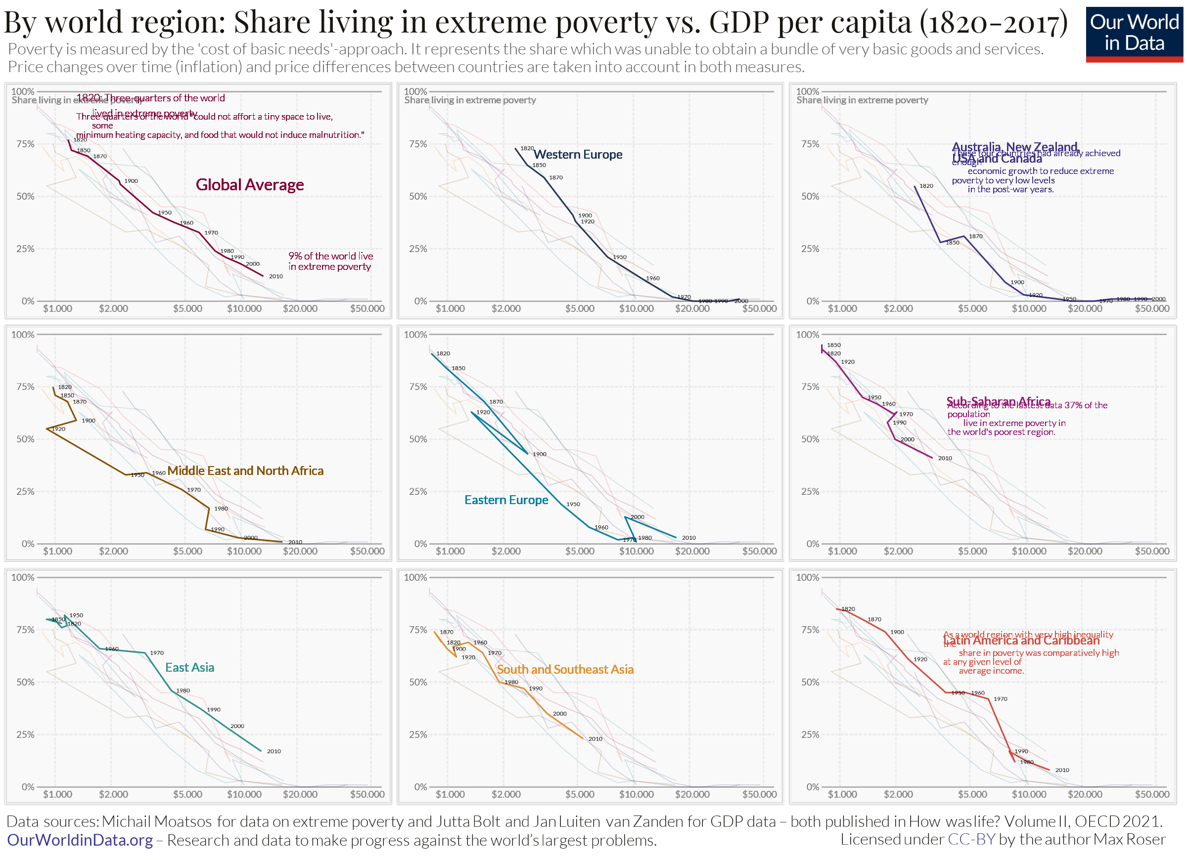
Behind the numbers: comparing extreme poverty and GDP per capita by world regions
By recreating from group up a OurWorldinData chart about extreme poverty vs GDP per capita we look at the foundations of Data Visualisation techniques layer by layer. Further, this project also proposes 2 alternative representation for the original data to better understand the story behin the numbers.
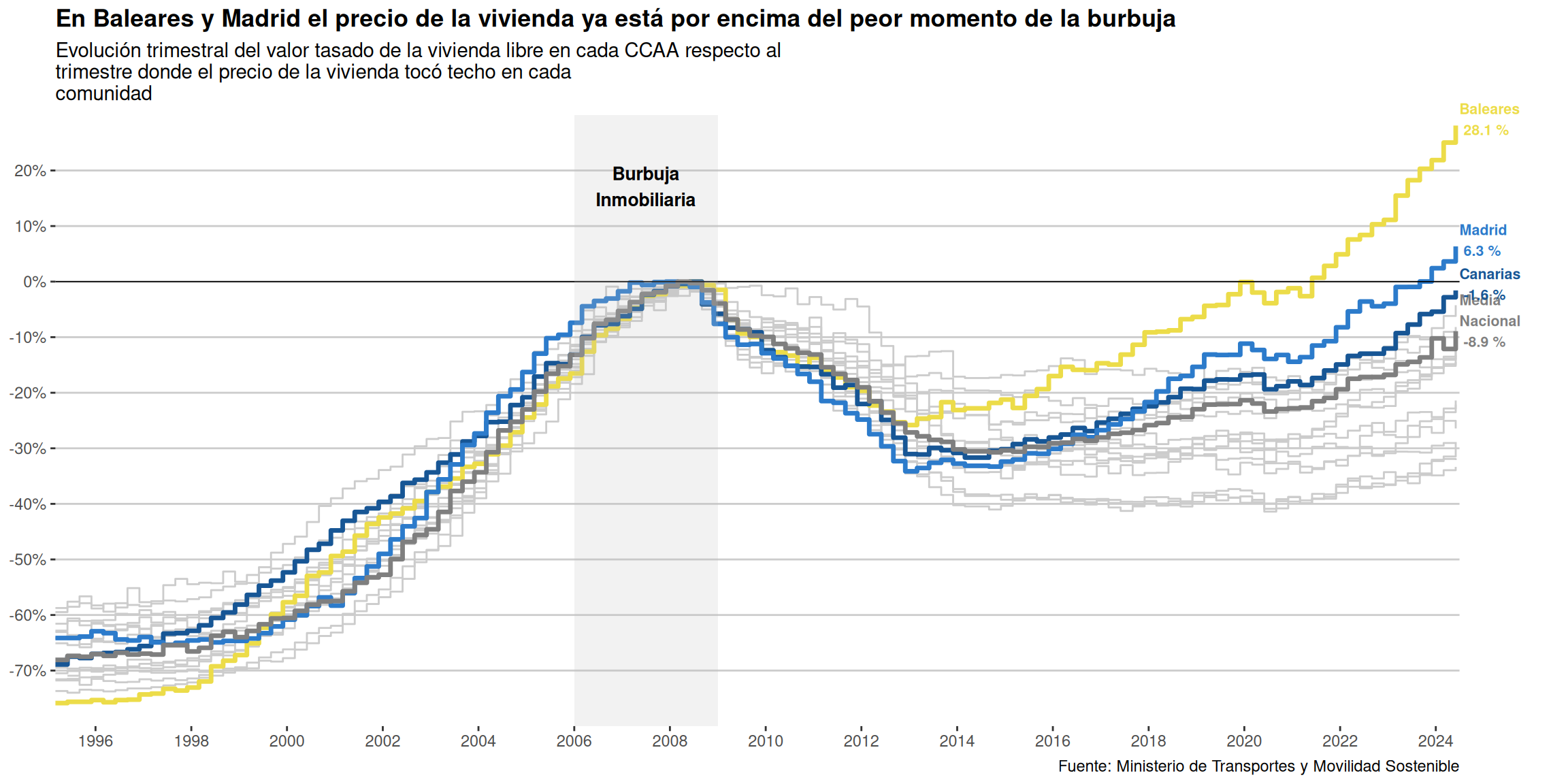
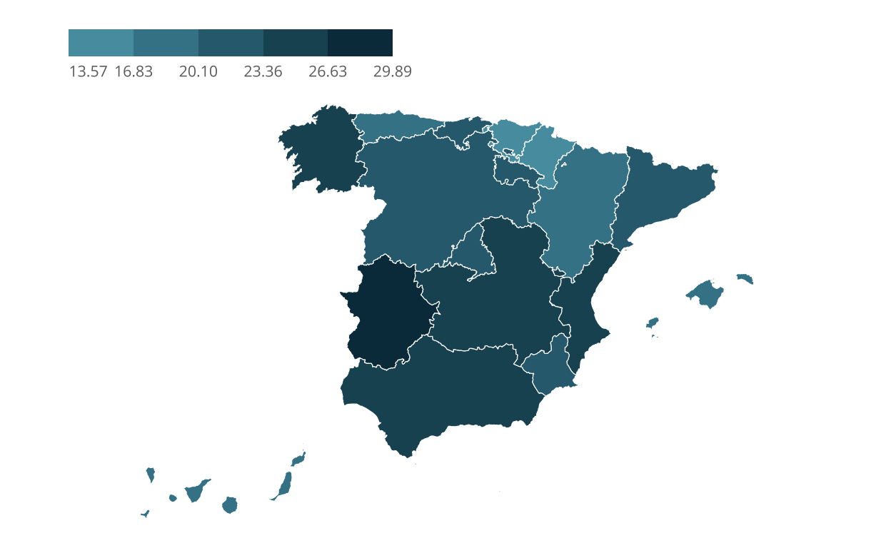
How housing is no longer a right
Visualization of the housing crisis in Spain according to official data from the Ministry of Transportation.
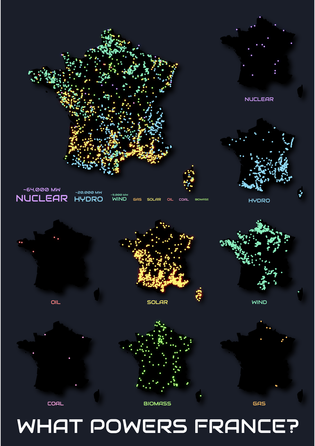
What Powers France?
A comprehensive visualization of power plants in France.
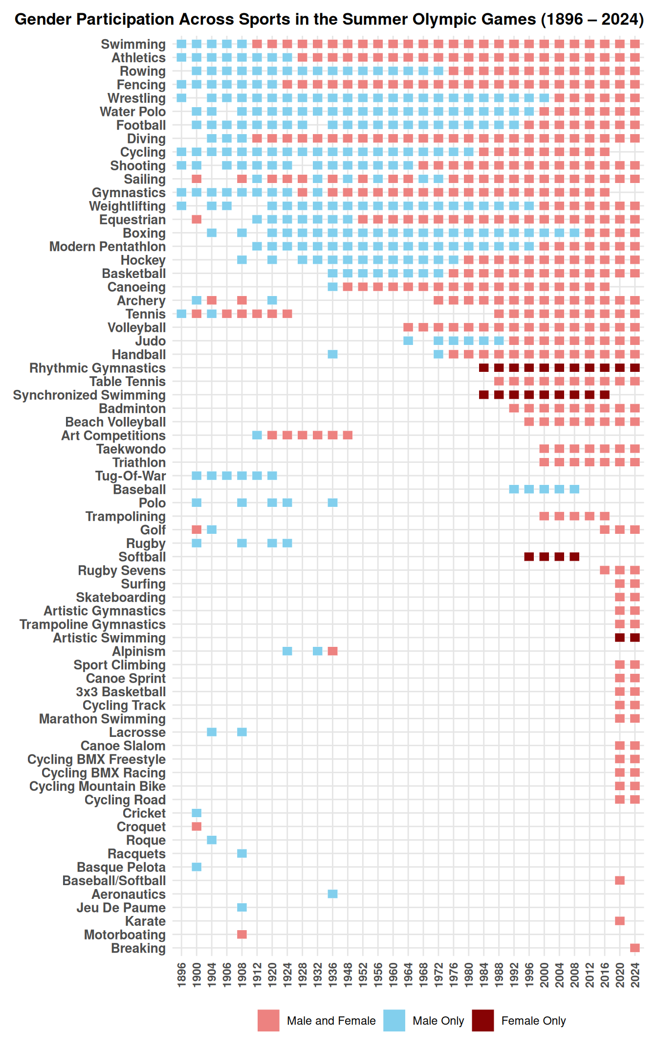
Gender Participation Across Sports in the Summer Olympic Games
Recreation, improvement and alternative visualizations of gender participation in the Olympics plot (1896 – 2024).
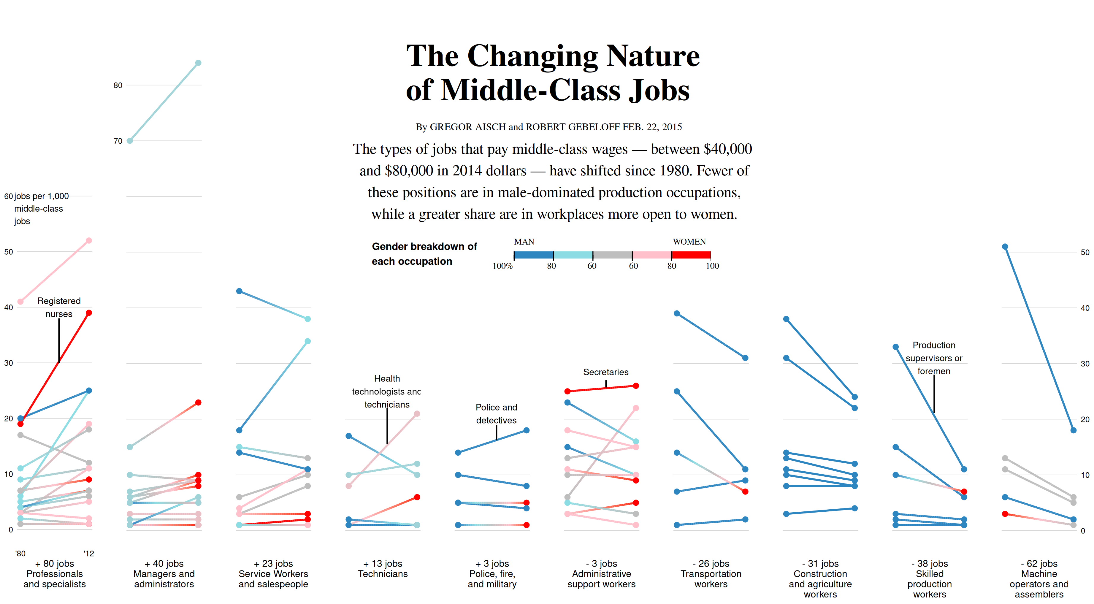
The Changing Nature of Middle-Class Jobs
The types of jobs that pay middle-class wages — between $40,000 and $80,000 in 2014 dollars — have shifted since 1980. Fewer of these positions are in male-dominated production occupations, while a greater share are in workplaces more open to women.
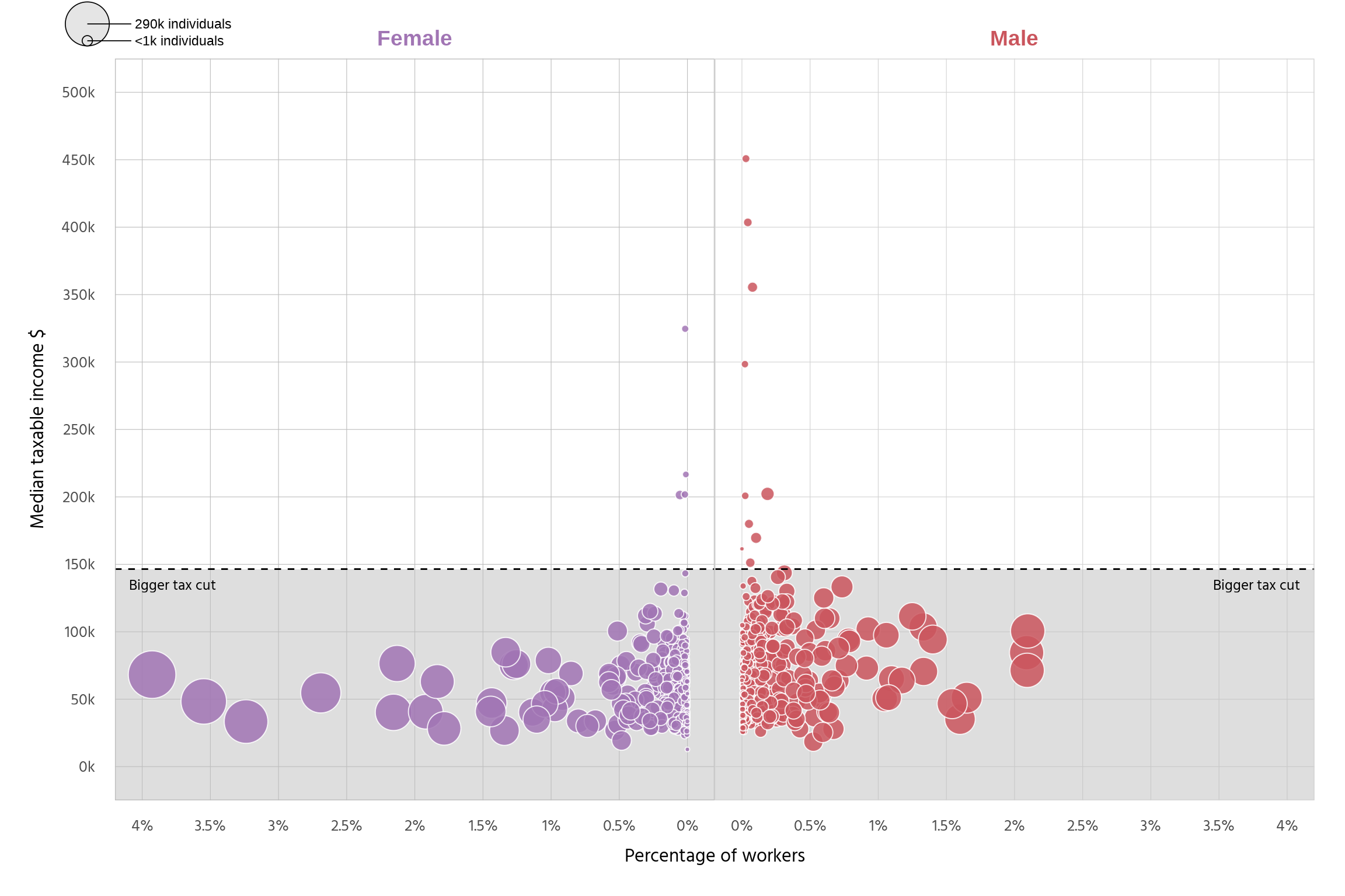
Winners and losers of tax legislation changes
Recreating the ABC news article Graph for MCSS Data Viz 24/25
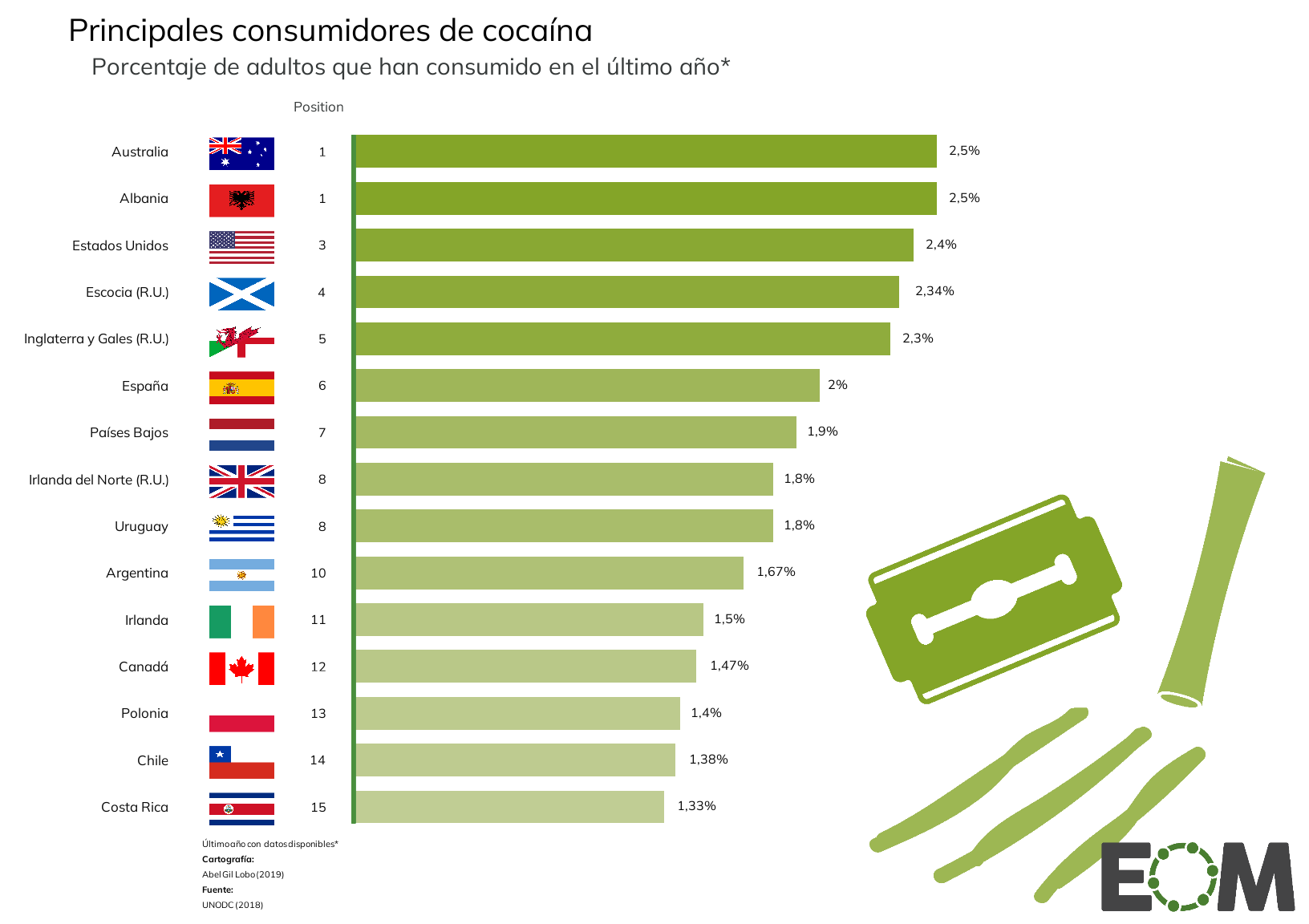
Cocaine consumption
This project aims to provide insights into the principal consumers of cocaine through a bar plot. I chose this topic because I find it interesting and relevant, especially in relation to the global issues surrounding drug trafficking. The bar plot serves as an effective tool to visually compare the data, making complex information more accessible and understandable. I was particularly inspired by the work of El Orden Mundial, which I consider they do a great job of visualizing data.
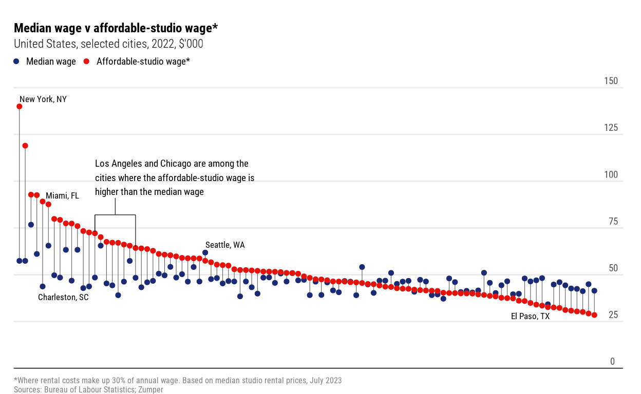
Exploring Where Americans Can Afford to Live Alone
Rising rents and stagnant wages make even modest apartments unaffordable in many U.S. cities
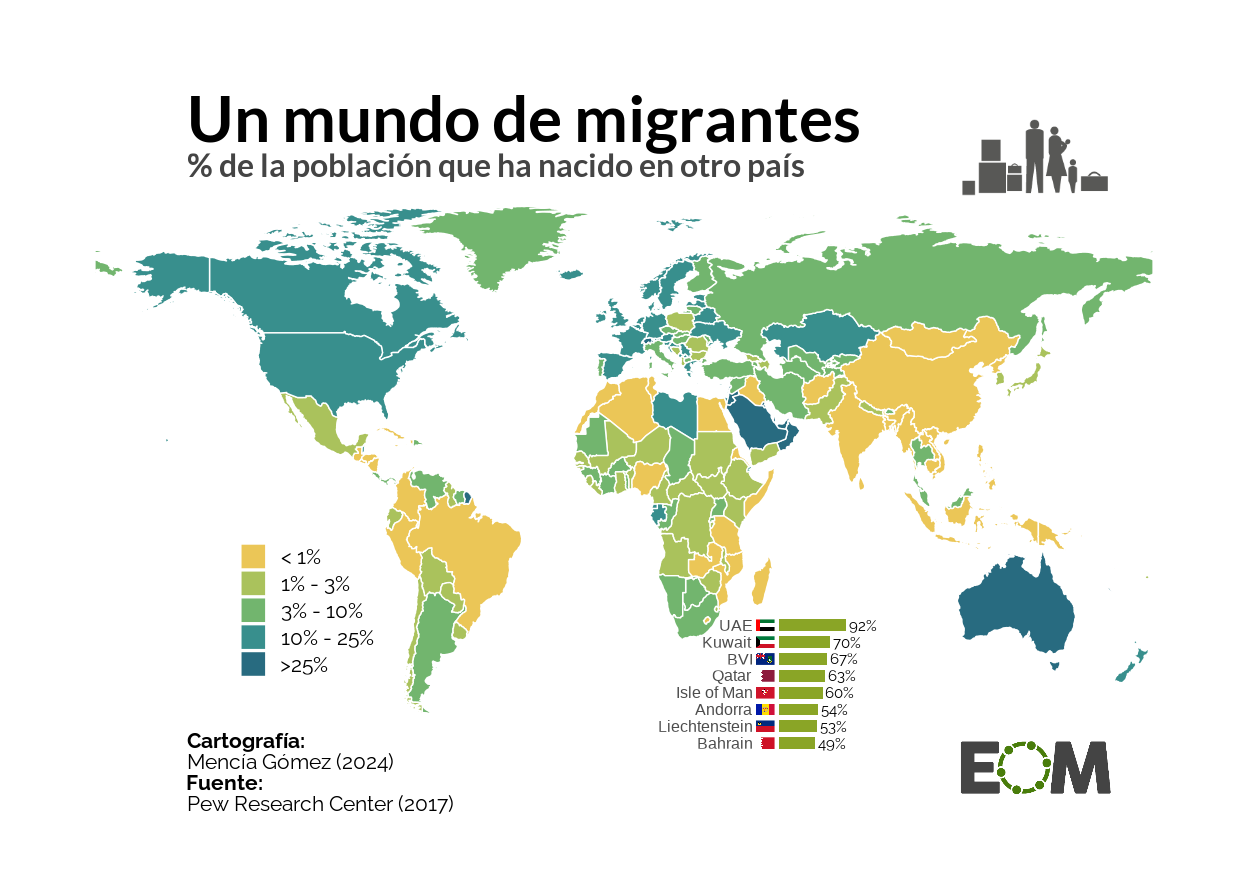
Global Map of Migration
Recreation and improvement of a migration plot
Where do 8 billion people live?
Replica and improvement of a map to show how the world population is distributed among different countries
Age Distribution of Athletes by Sport since 1896
This project focuses on recreating a The Washington Post graph showing the olympic athlete distribution by sport and age since the inception of the modern games in 1896.
Degrees and Nobels: A non-essential link
A comprehensive look at Nobel Prizes from 1901 to 2012, uncovering patterns in laureates ages, trends across categories, educational qualifications, academic affiliations and hometown demographics.
Abortion Access and Sex Education Policies in the United States
Below is an analysis and replication of the graph by Sara Chodosh, originally published in The New York Times, which examines the relationship between abstinence-focused sex education requirements and abortion access restrictions across U.S. states.
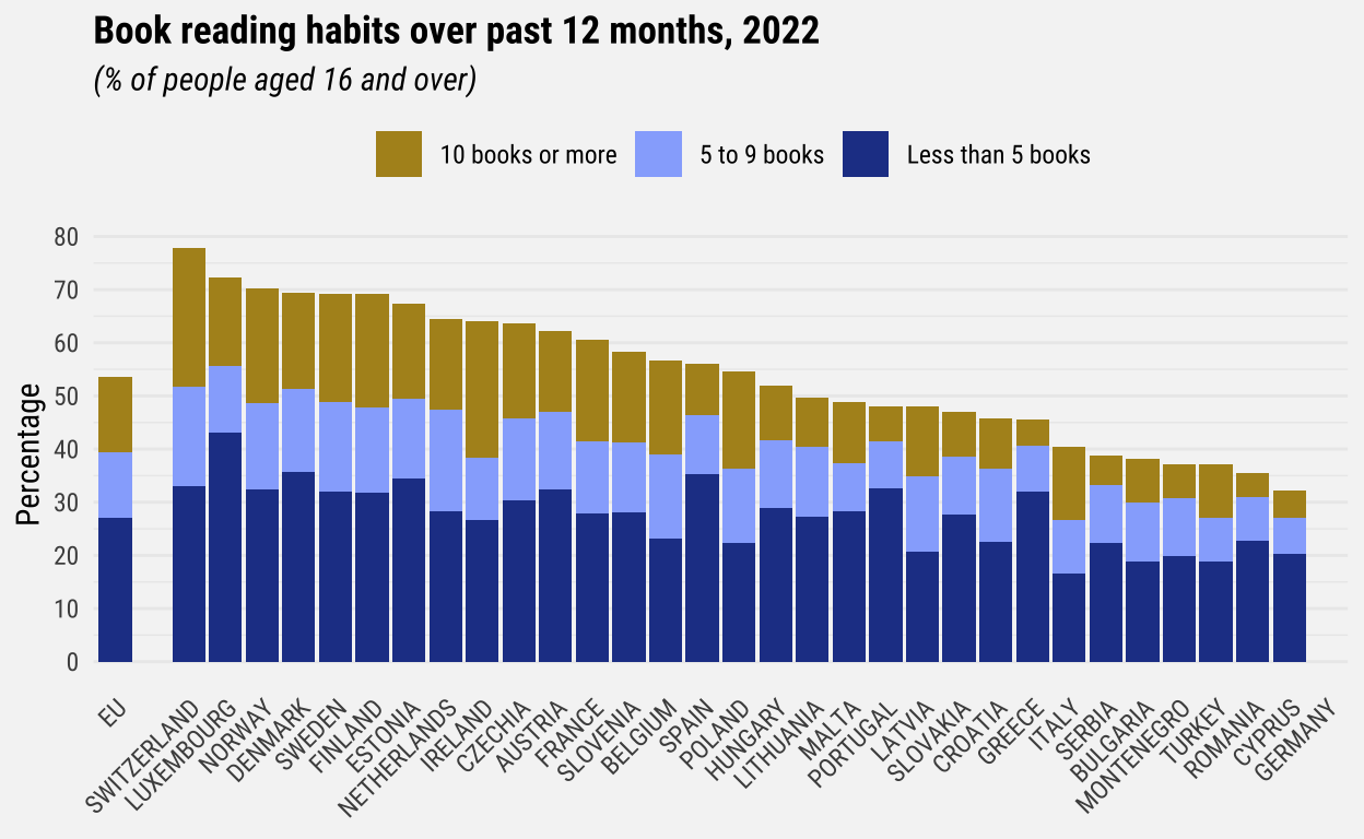
Book reading habits
This project explains how to replicate and create an alternative version of a chart from Eurostat about book reading habits.
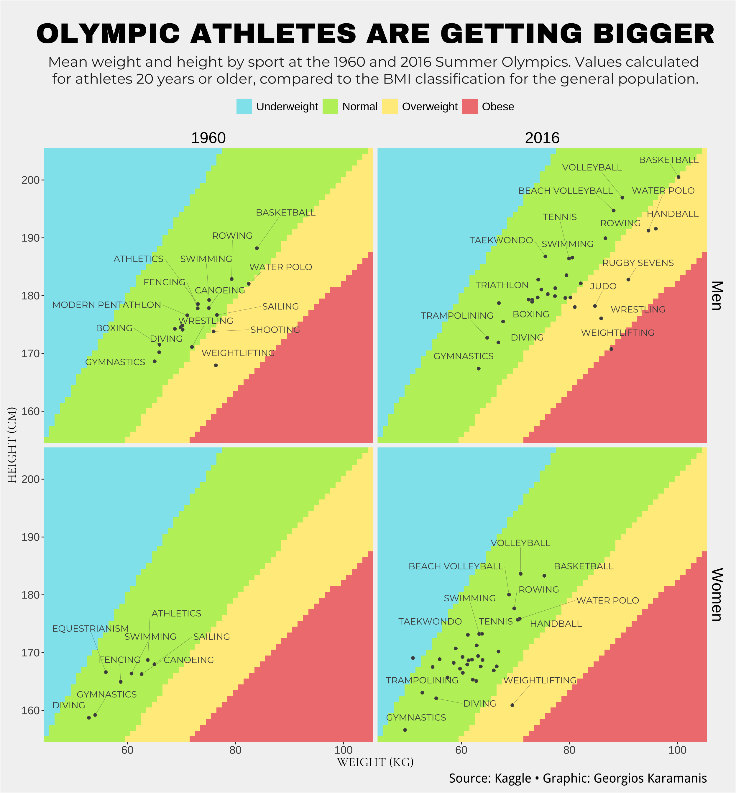
An 8-Bit Look at the Evolution of BMI Values of Olympic Athletes
This study displays the evolution of BMI values of Olympic athletes who competed in the Summer Olympic Games of 1960 and 2016.
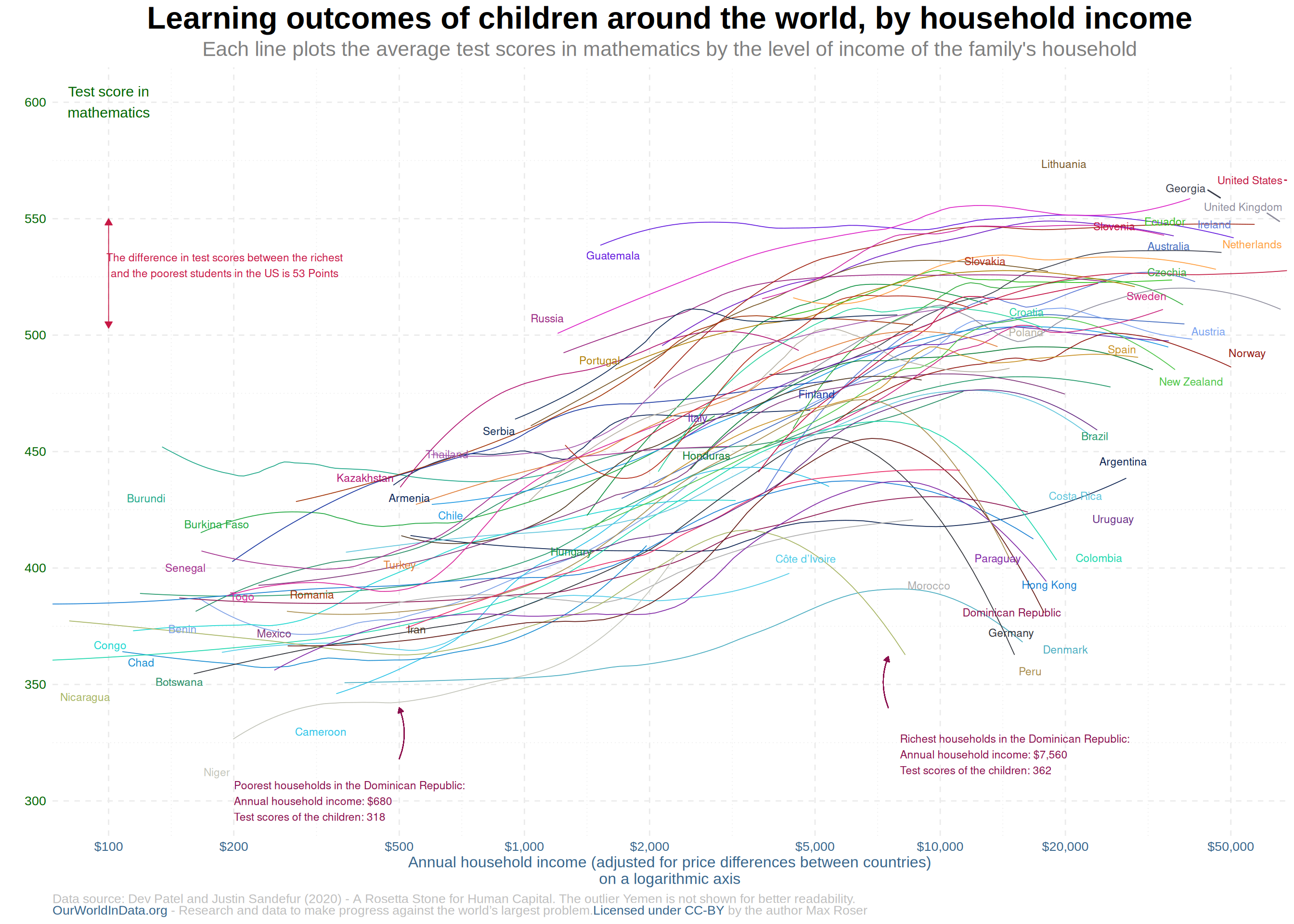
Reproducing Learning Outcomes Graph
Household Income and Test Scores (Dev Patel & Justin Sandefur, 2020)
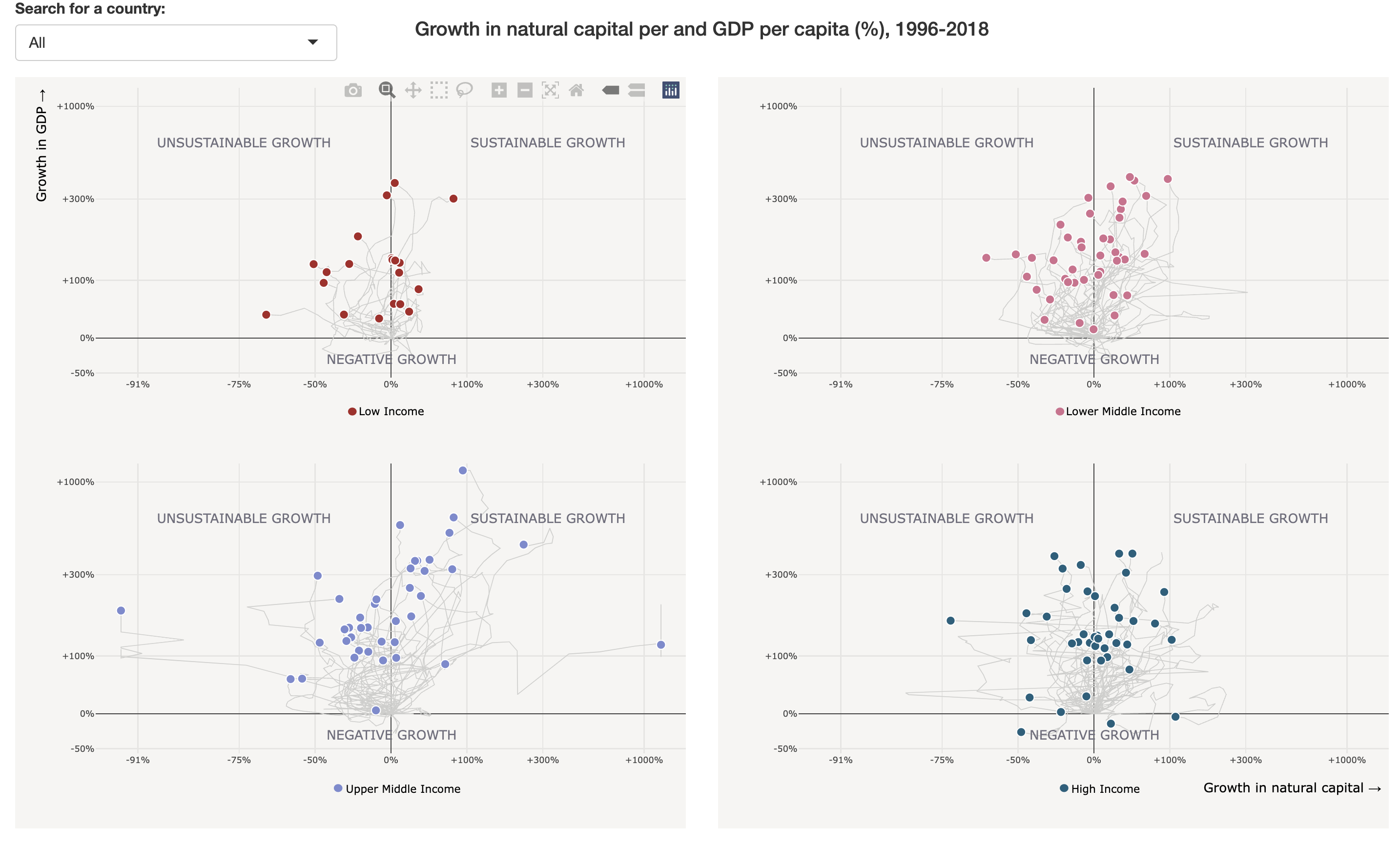
Is economic growth in your country still costing natural resources?
Sustainable production and consumption are essential. Since the mid-1990s, many countries have increased their natural capital by 26.8%, proving that economic growth can happen without depleting resources. Yet, some countries still depend on resource exploitation for growth.
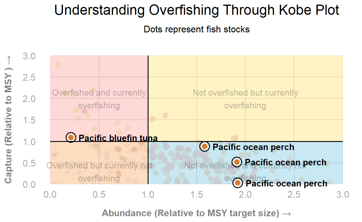
Global Fish Stock Overfishing Status
Replication of a chart illustrating fish capture and abundance relative to sustainable levels.
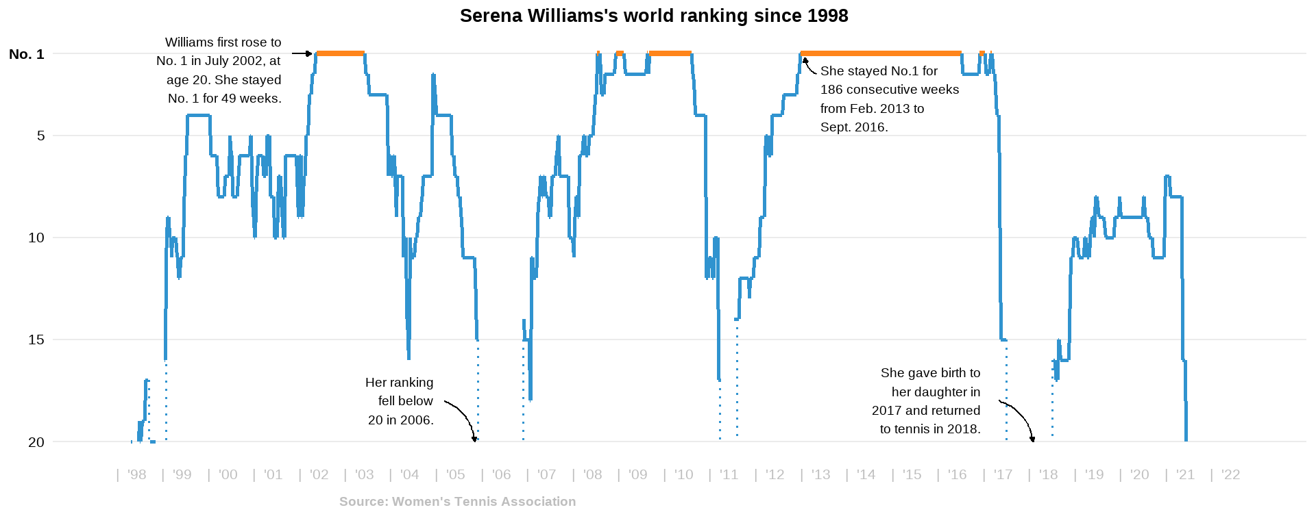
Serena Williams Career
It shows the ranking of the famous tennis player.
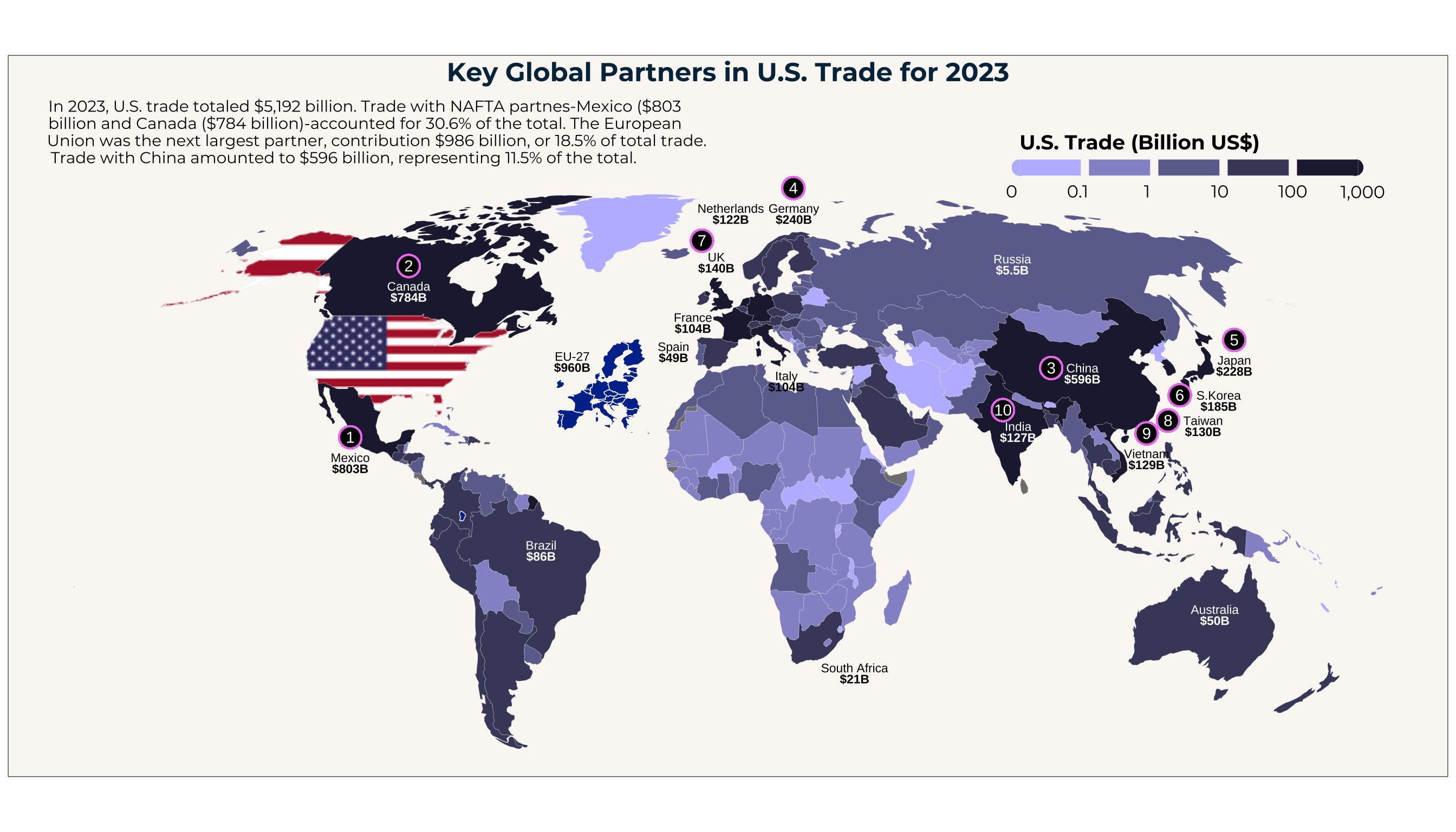
Key Global Partners in U.S. Trade for 2023
Worldwide U.S. Trade in Billions by country in 2023
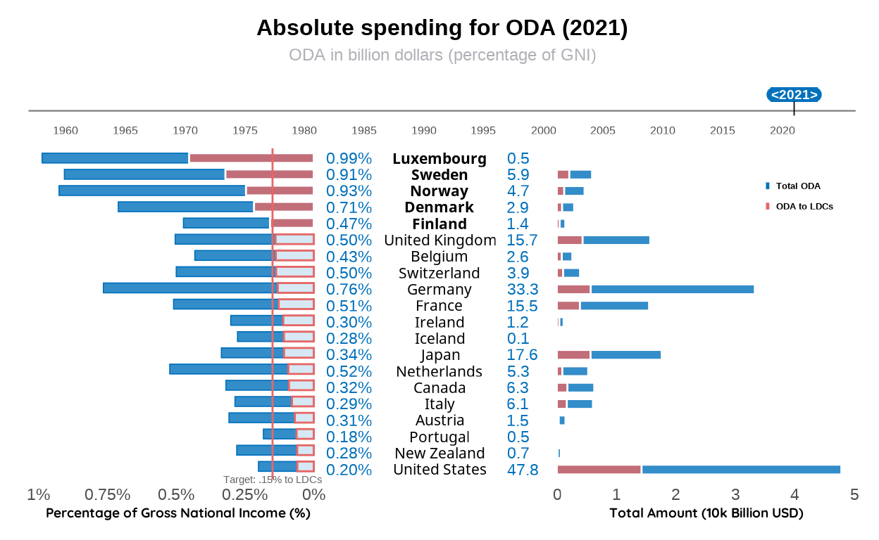
ODA: the catalyst for progress
Using The World Bank's ODA data to reproduce its original graph and other visualizations. "ODA" is the abbreviation for "official development assistance", which refers to the government aid provided to promote the economic development and welfare of developing countries.
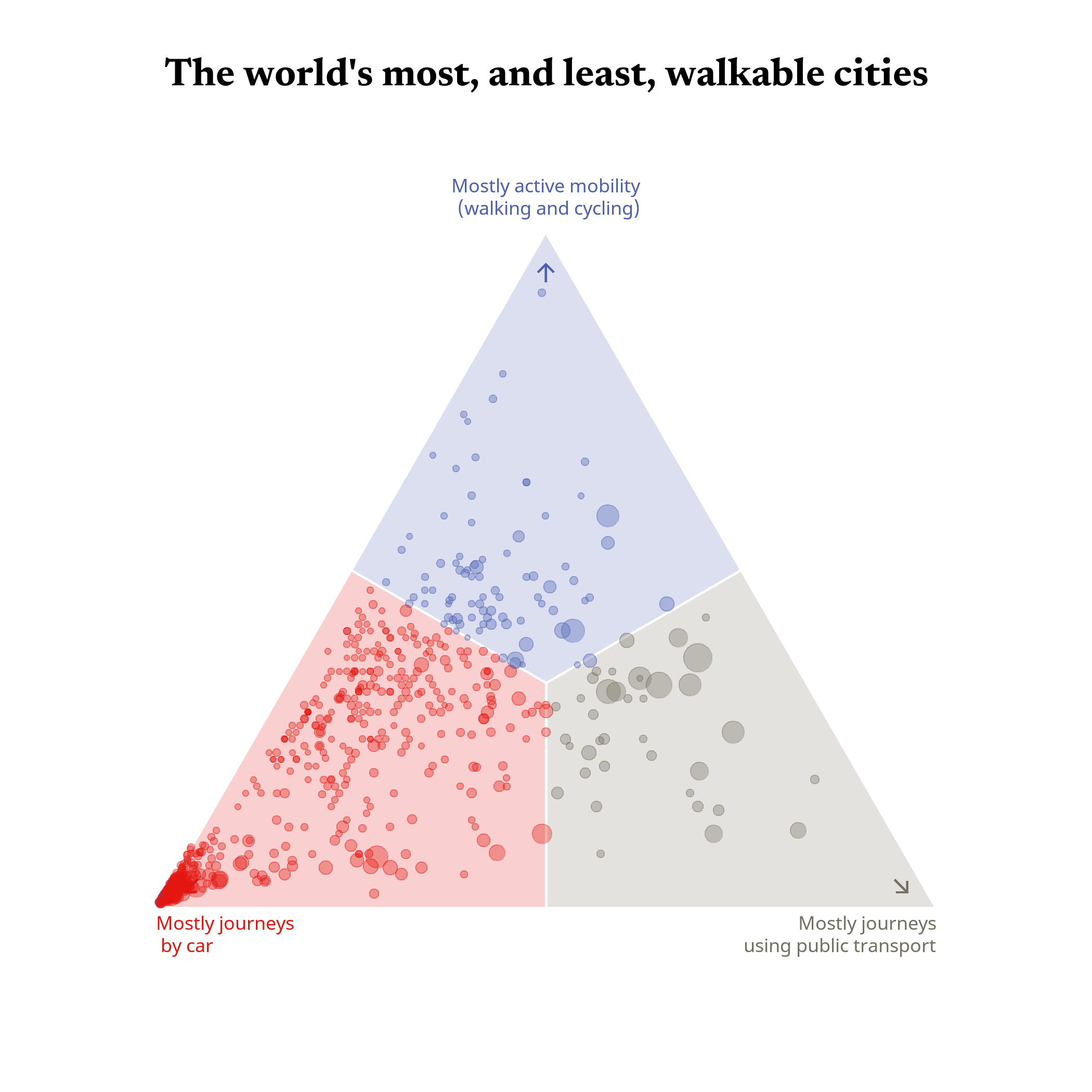
The world’s most, and least, walkable cities
Ternary graph by ‘The Economist’ of commuting patterns in cities worldwide, highlighting the proportions of journeys made by car, active mobility (such as walking and cycling), and public transport. The data is based on the study 'The ABC of Mobility' by Rafael Prieto-Curiel and Juan P. Ospina.
Global trade flows in 2022
Using UN Comtrade trade data of 2022 to reproduce the resourcetrade.earth world map and produce an alternative network graph.
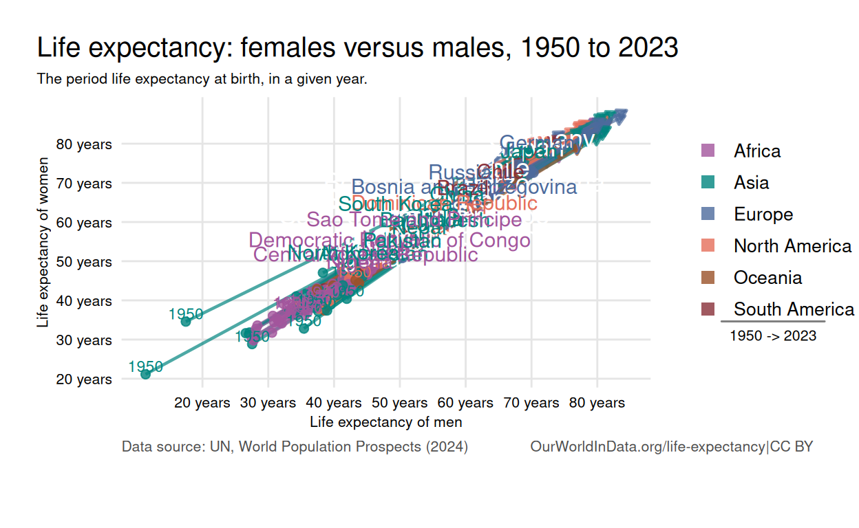
Life expectancy: females versus males
This chart compares the life expectancy of women and men at birth.
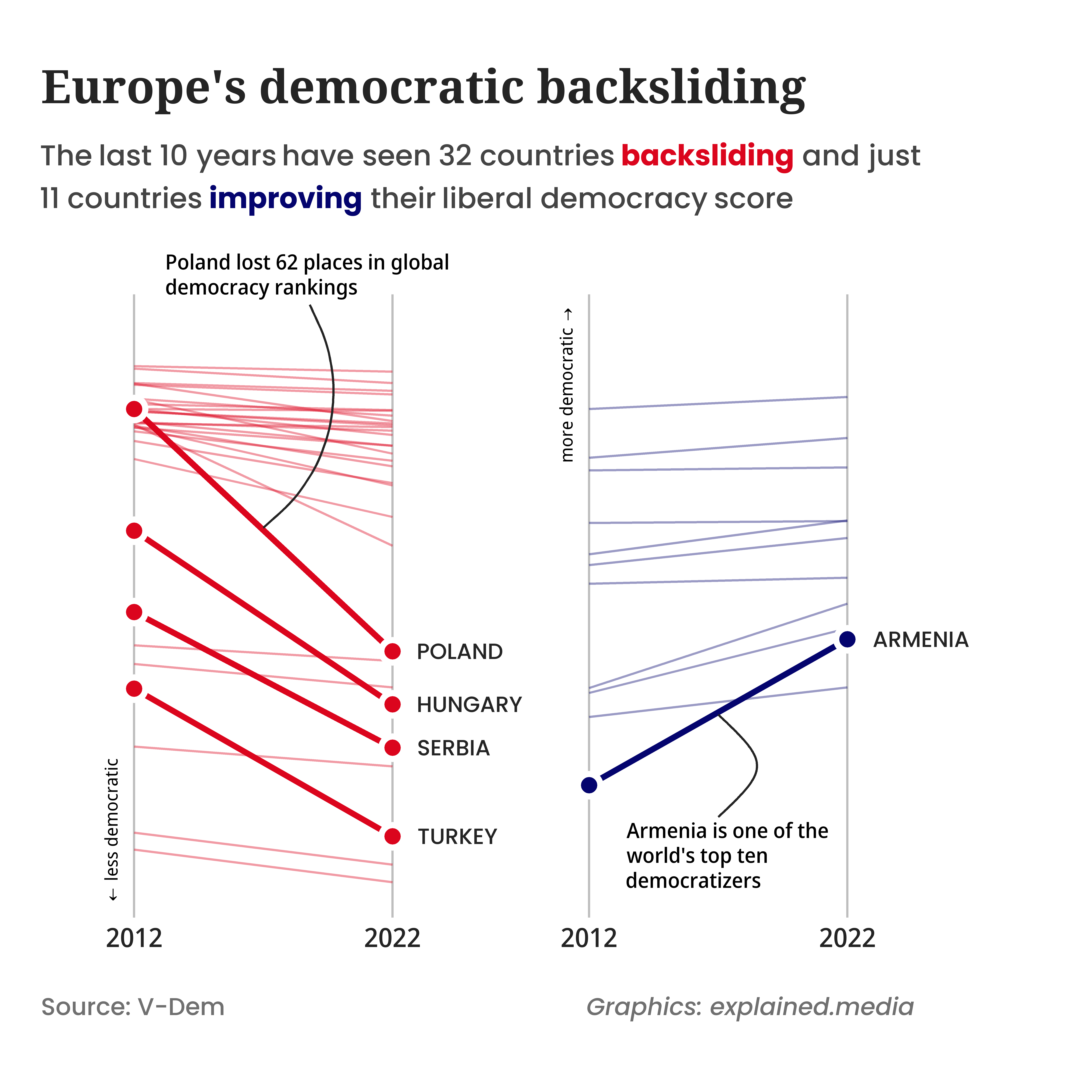
Democratic backsliding in Europe
A visual representation of the weakening of European democracies in recent years
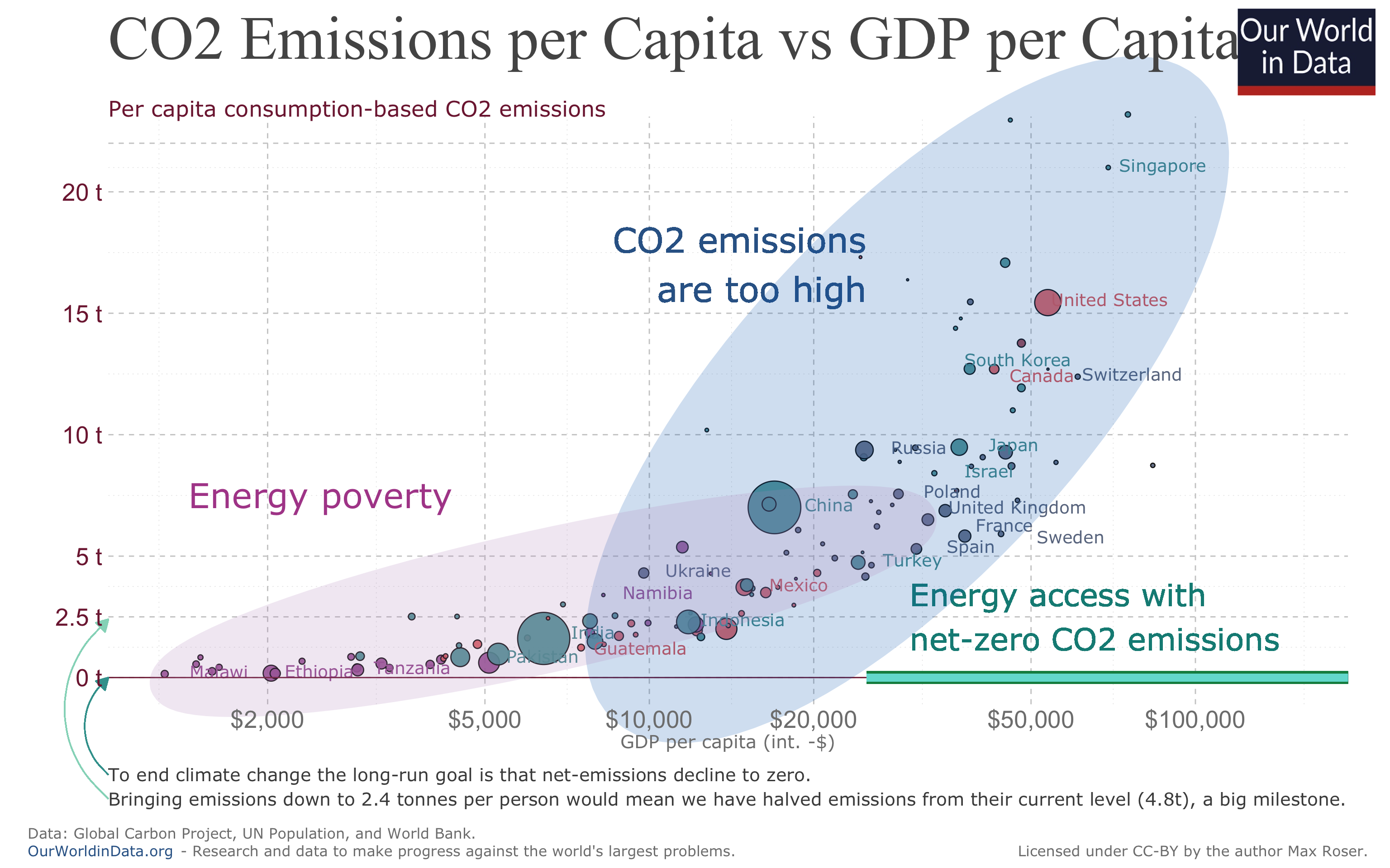
Exploring the Global Link Between CO2 Consumption and GDP: A Visual Journey
This work explores the relationship between CO2 consumption per capita and GDP per capita worldwide, through a series of visualizations created using mainly the ggplot2 package in R. Starting with an original graph from Our World In Data, we replicate and enhance it. These improvements range from adjustments to labels and colors to the addition of reference lines to highlight trends and patterns. Throughout the process, key improvements are made to increase clarity, visual accessibility, and inclusivity, ensuring the graphics are easily interpretable by a diverse audience, including those with visual impairments. Lastly various types of plots such as other scatter plots, box plots, bar plots, and area plots are made with the same data base.
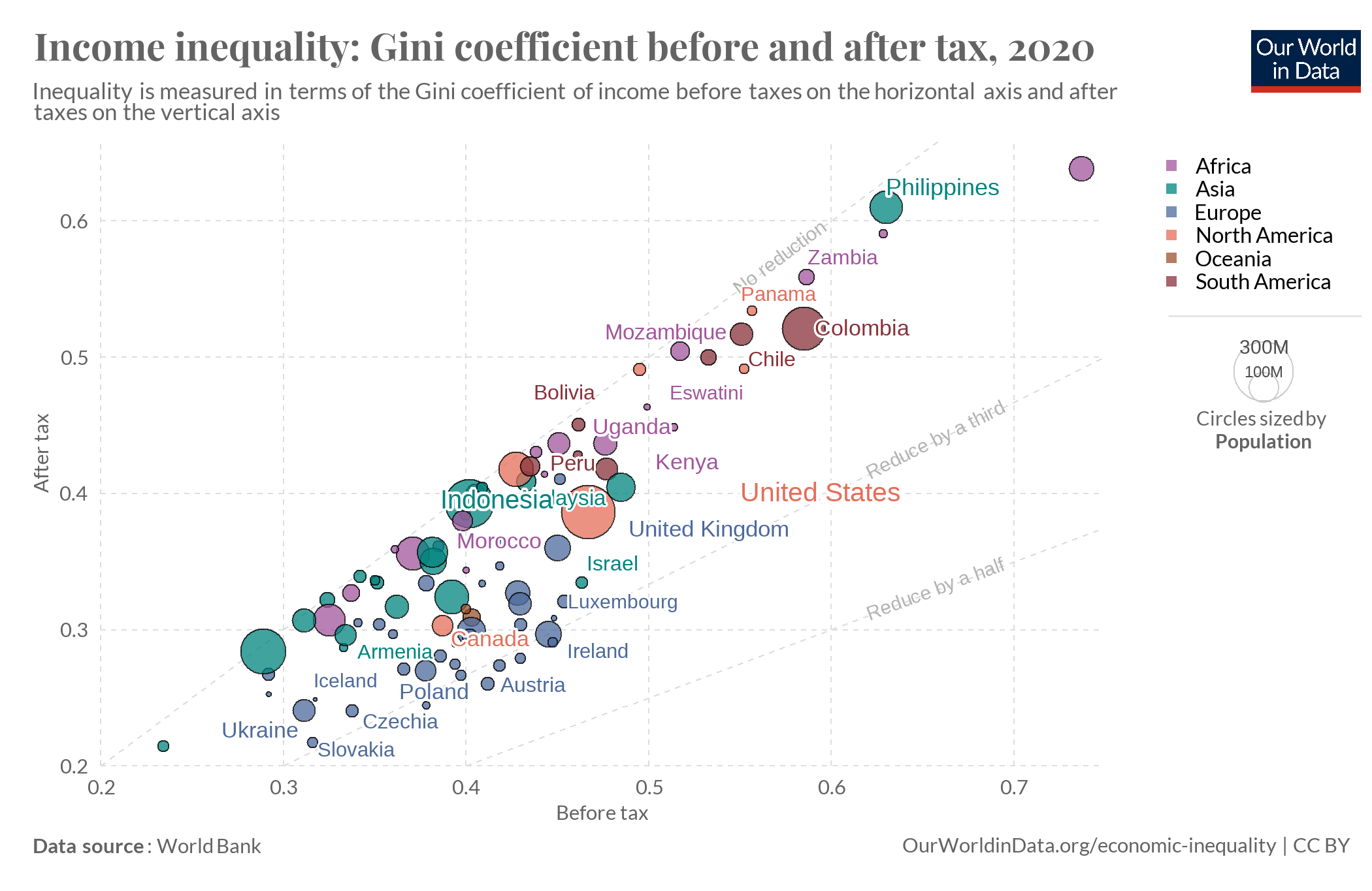
Income inequality: Gini coefficient before and after tax
This project explains how to replicate and create an alternative version of a chart from Our World in Data about the difference in the Gini coefficient before and after the redistribution of taxes.
The economic balance of the Olympic Games
This project aims at the reproduction of a graph displaying the costs and revenues of each summer and winter Olympic Games from 1964 to 2022.
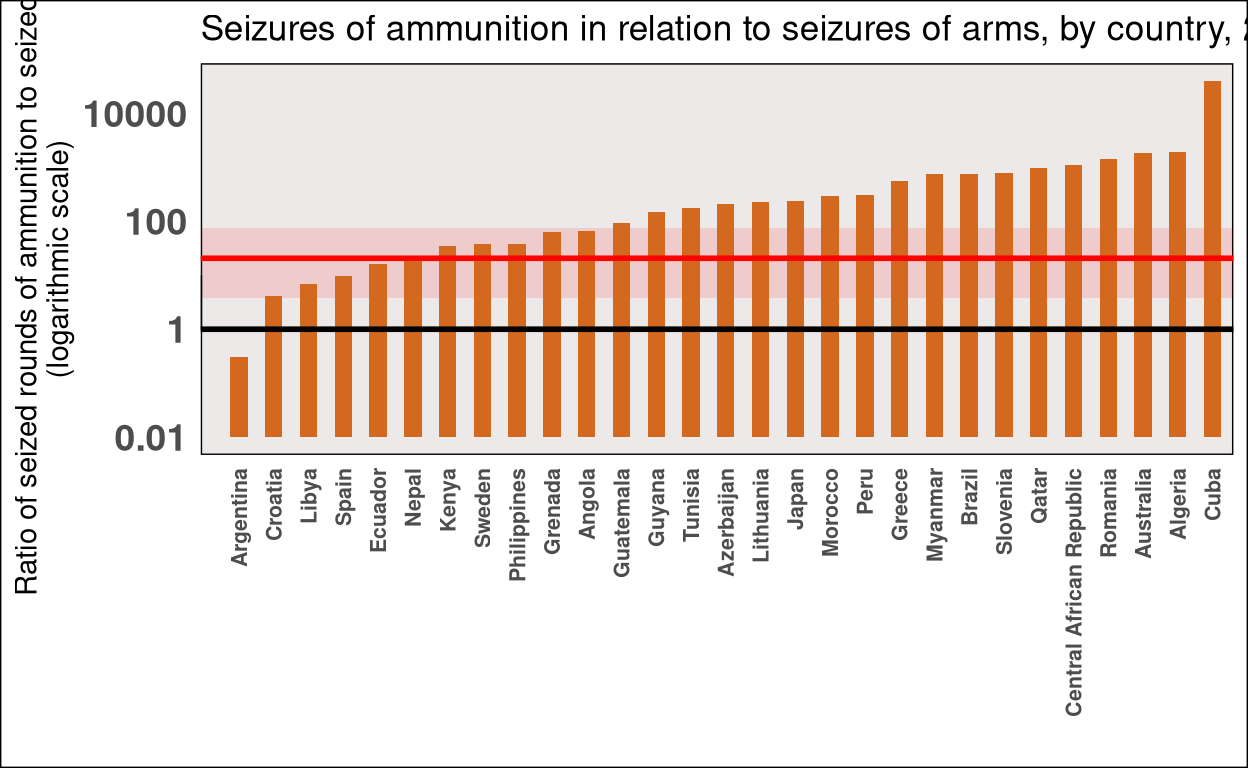
Seizures of Ammunition and Arms by Country 2017
A brief report based on UNs 2020 Global Study on Firearms Trafficking.
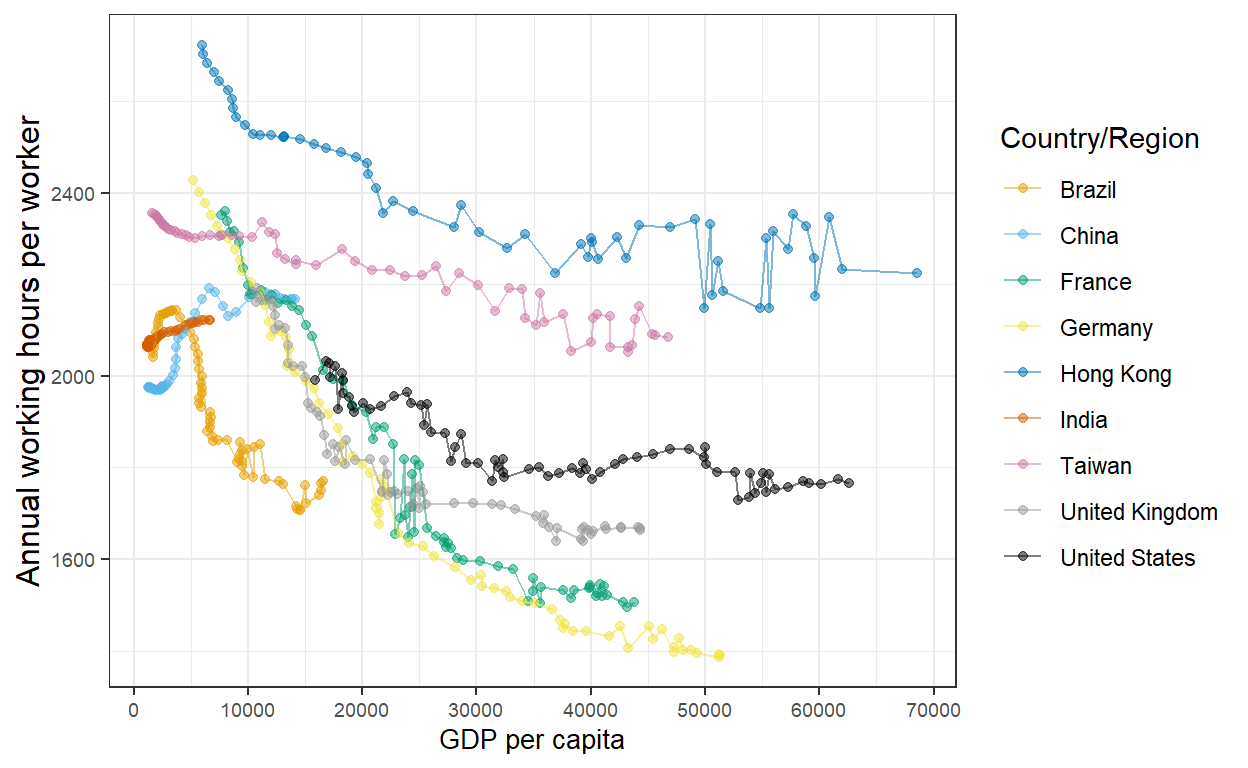
The Evolution of Working Hours in the World
This project consists in the replicaion and alternative representation of graphs from Our World in Data called "Working Hours".
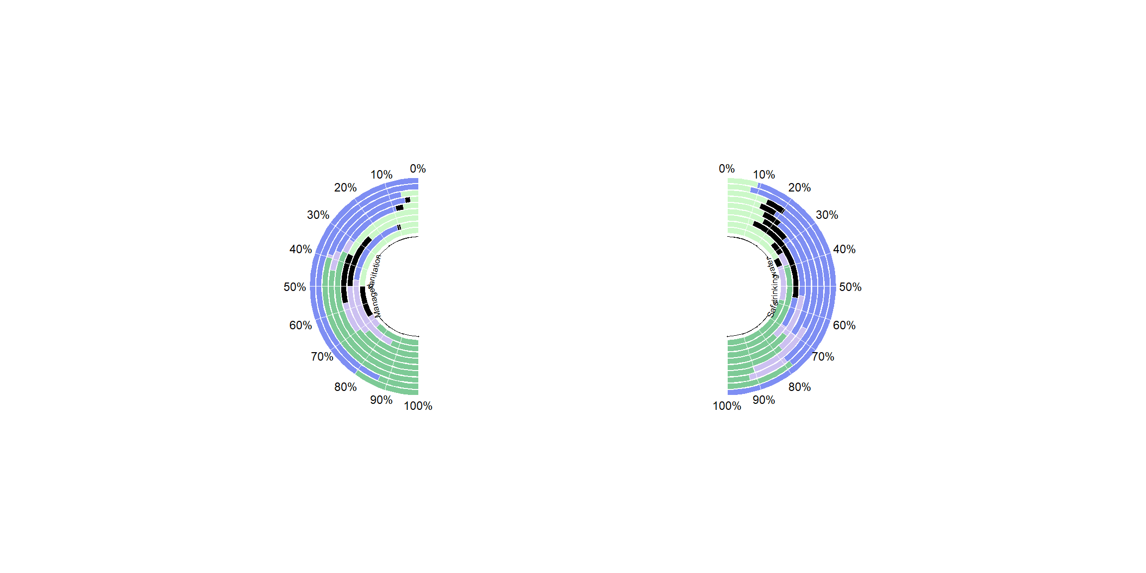
Water Sanitation Visualization
Graph on the use of water and water sanitisation tools among the various regions of the world.
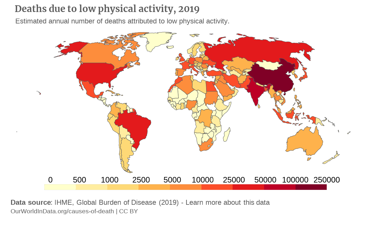
Is the World Moving Enough?
A look at the mortality due to low physical activity worldwide.
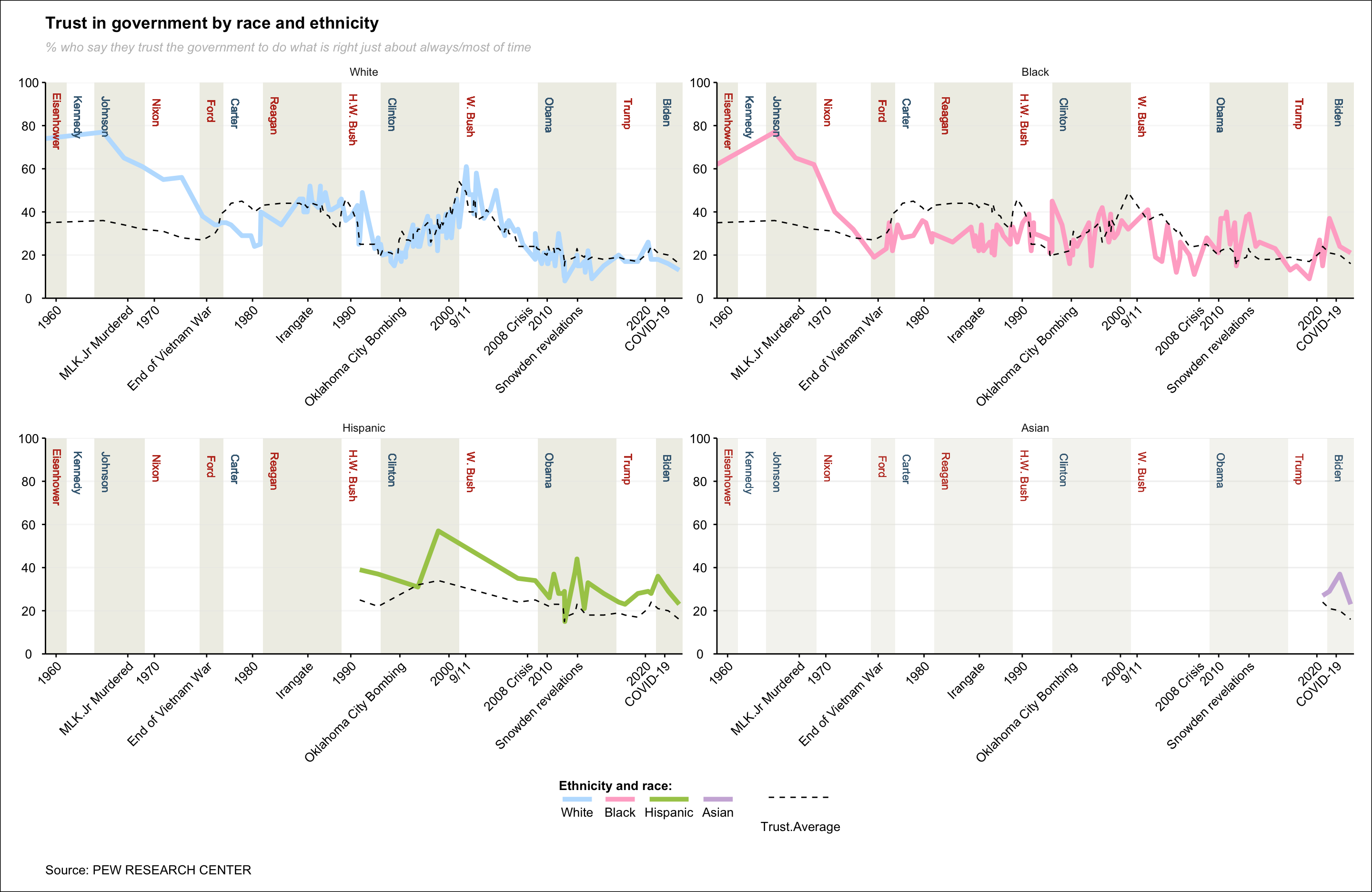
Public Trust in Government
Visual representation of the evolution of public trust in the United States government by race and ethnicity from 1958 to 2023, as documented in the Pew Research Paper.
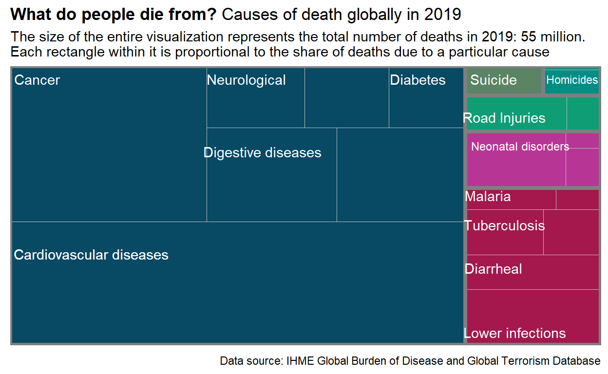
Causes of Deaths 2019
Treemap that describe the causes of death before covid pandemic.
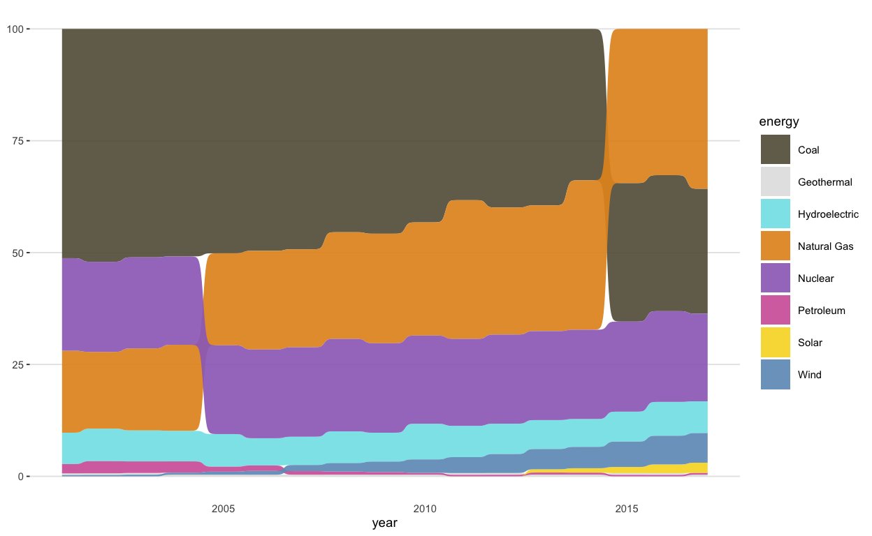
Changing Sources of Electricity Generation in the United States
This graph describes how the sources of electricity generation in the United States have changed from 2001 to 2017.
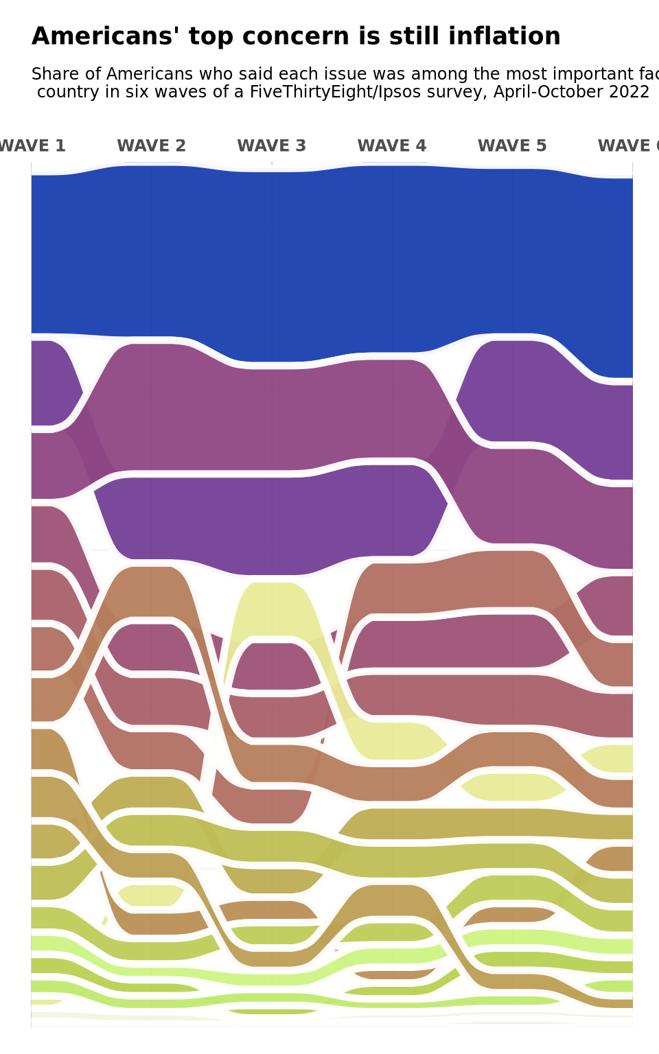
American's Top Concerns 2022
Most important issues for Americans, April-October 2022: step-by-step replication graph and a possible alternative.
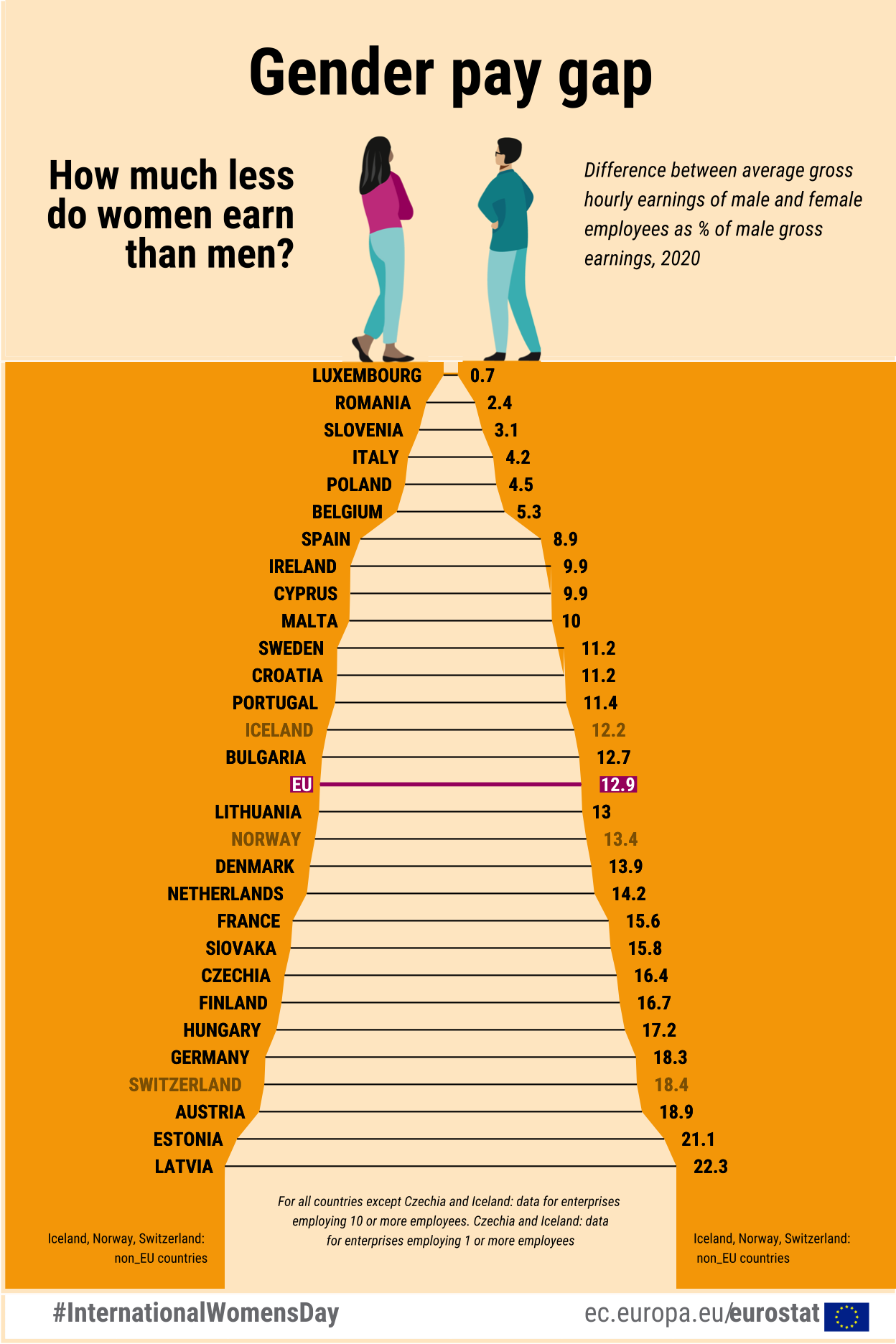
Gender Pay Gap Graph Replication
Using Eurstat data to reproduce the Gender Pay Gap graph of 2020.
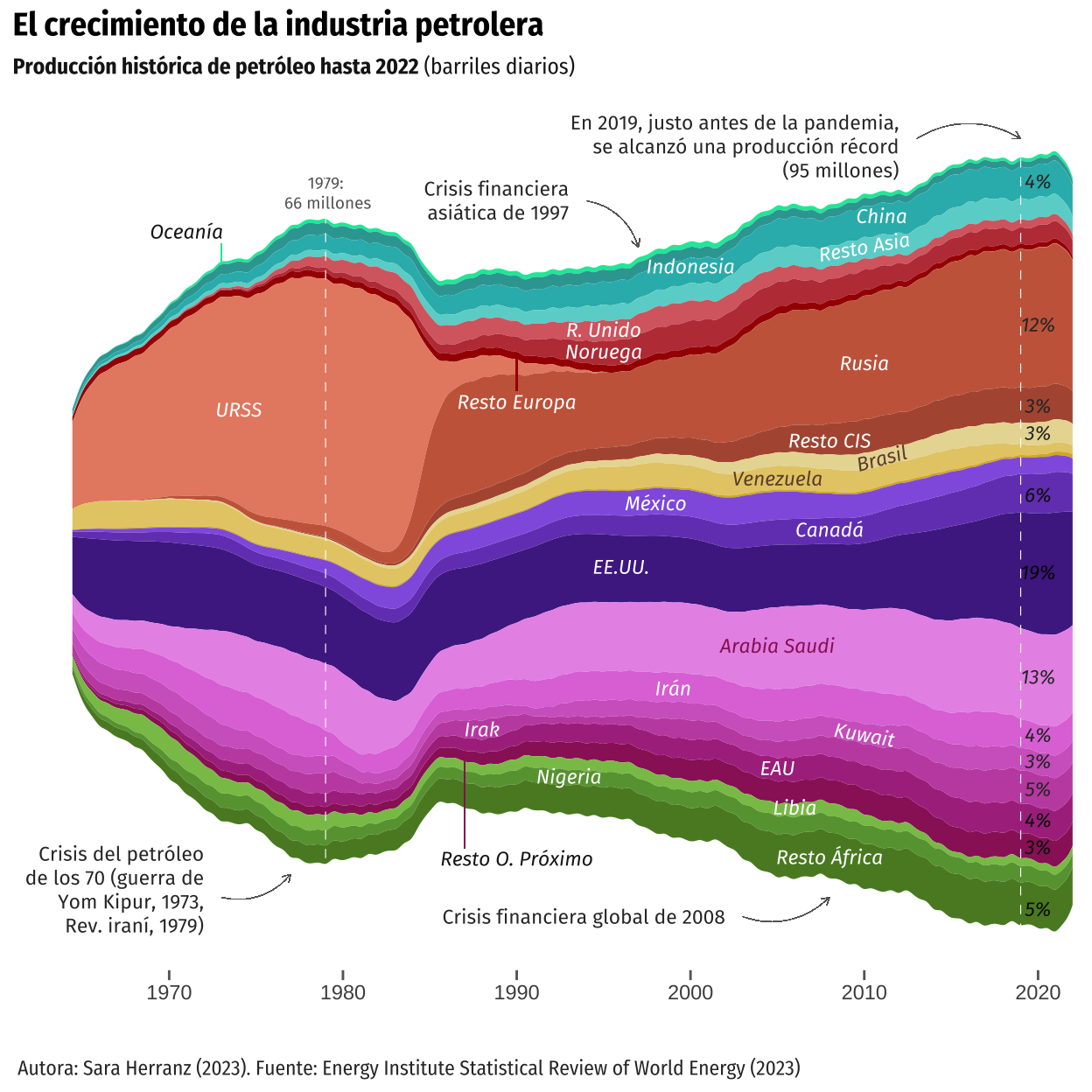
The Growth of the Oil Industry
Replication of a graph from El Orden Mundial which aims to represent the evolution of oil production since 1910.
Unveiling Birth Clinical Practice in Spain: Mapping the Cesarian Sections and Birth Dynamics
Exploring the nuances of maternal healthcare in Spain through an augmented map, showcasing original cesarean section rates alongside additional insights such as total births per autonomous community and cesarean rates adjusted for the average maternal age.
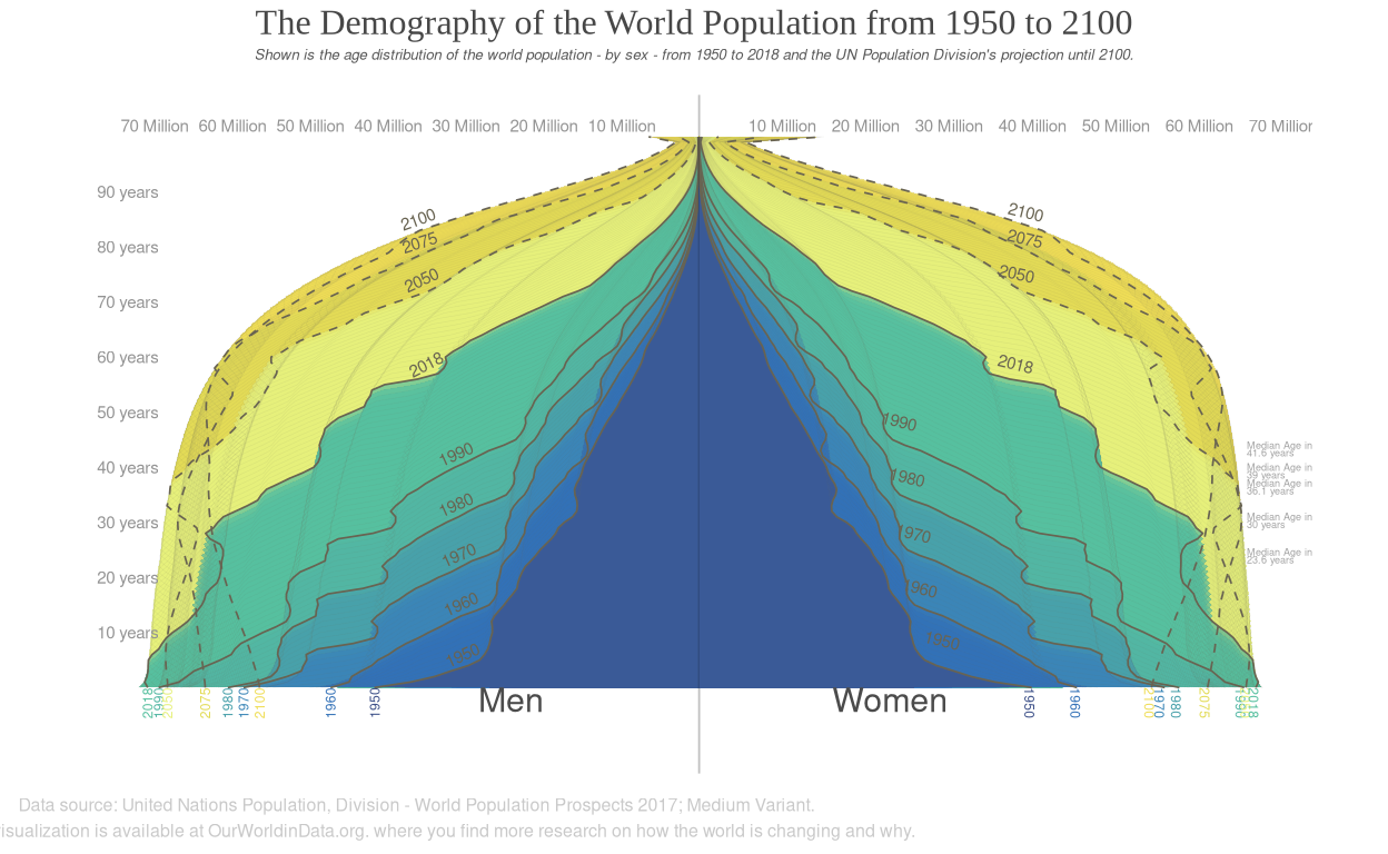
The Demography of the World Population from 1950 to 2100
Visualizing how global demography has changed and what we can expect for the 21st - century Our World in Data.
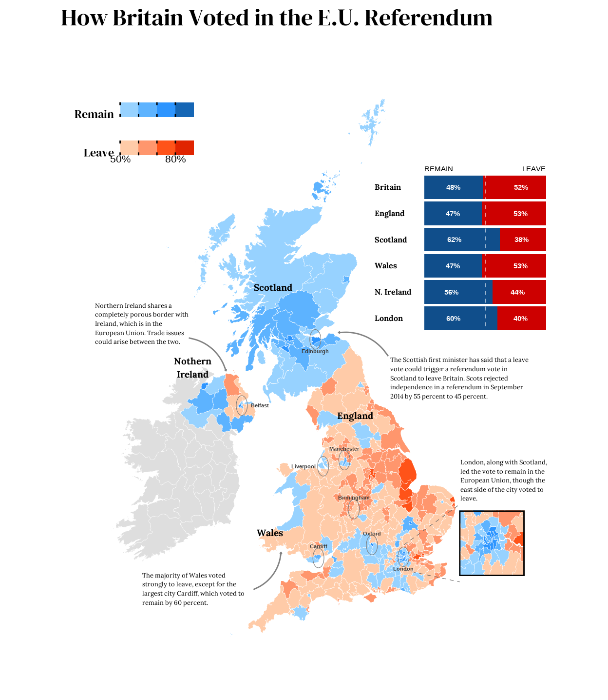
How Britain Voted in the E.U. Referendum
Britons voted on Thursday to leave the European Union. The Leave side led with 17.4 million votes, or 52 percent, versus the Remain side’s 16.1 million, or 48 percent, with a turnout of around 72 percent.
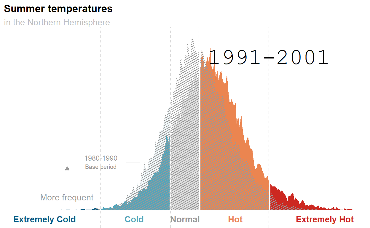
We Feel It Already. How About We Visualize It?
Summer temperatures are getting hotter and this plot does a pretty good job at showing that.
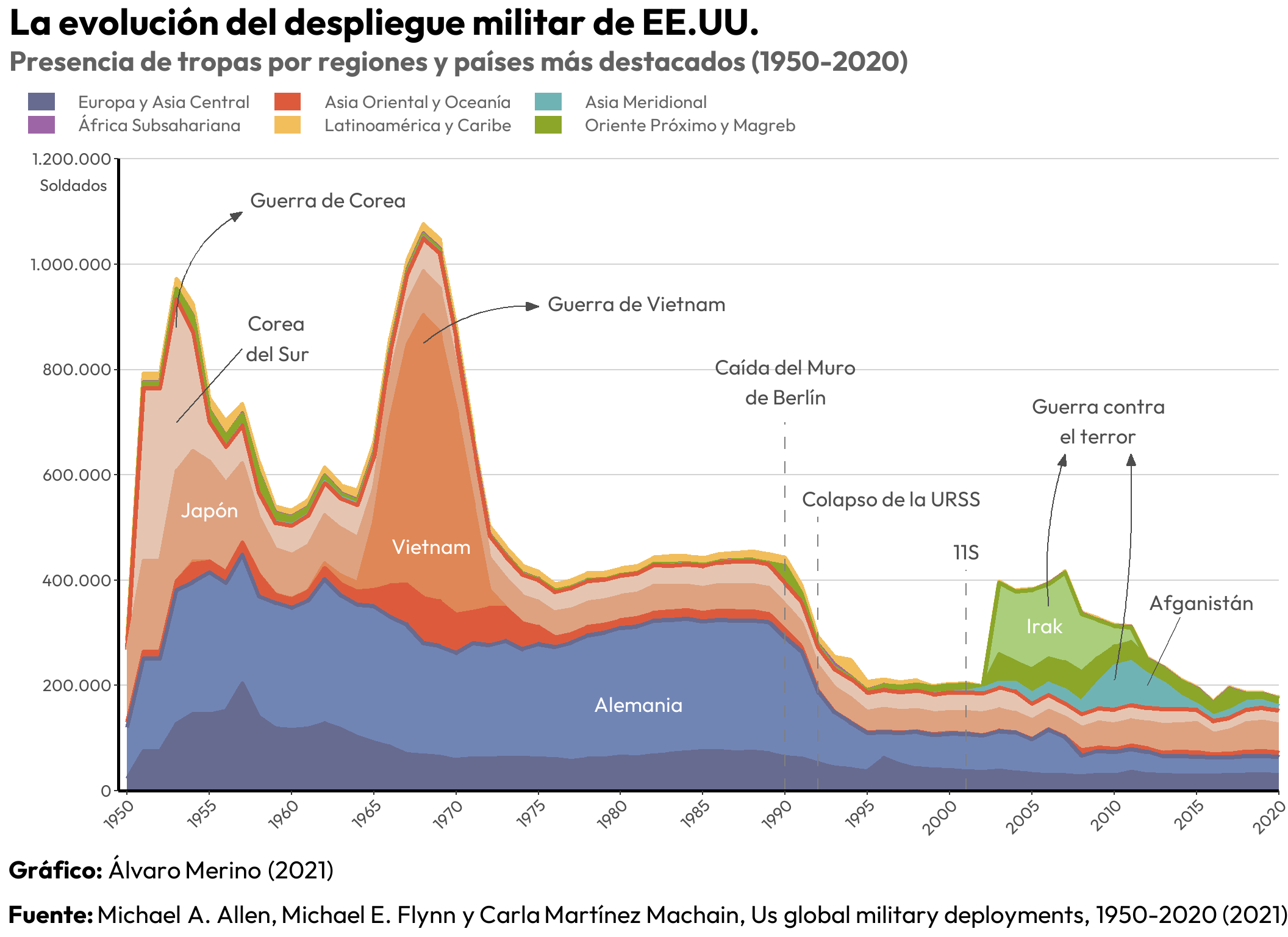
The Evolution of the US Military Deployment
Visualising data on the evolution of the US military presence around the world from 1950 to 2020.
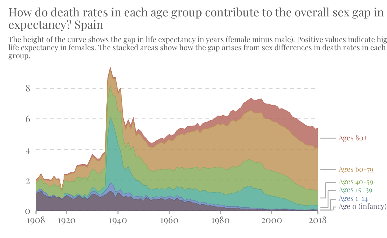
Sex Gap in Life Expectancy in Spain
How many more years do Spanish women live compared to men? This project replicates and enhaces a World in Data graph showing the evolution of the sex gap in life expectancy from 1908 to 2018 in Spain.
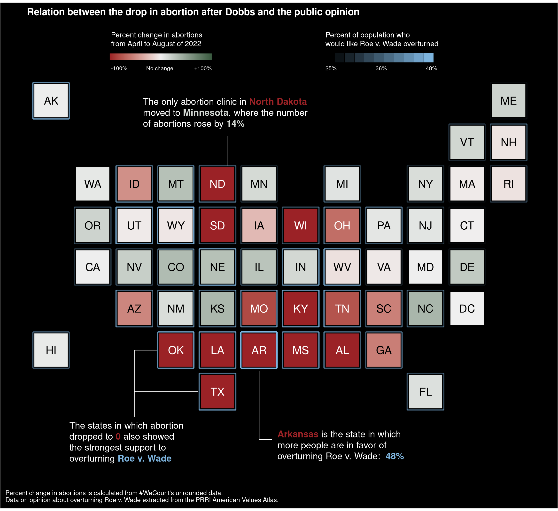
Change in Abortion after Dobbs
Visualization of the change in abortion data after the Dobbs decision, which gave power of legislation over abortion to the different states of the U.S.
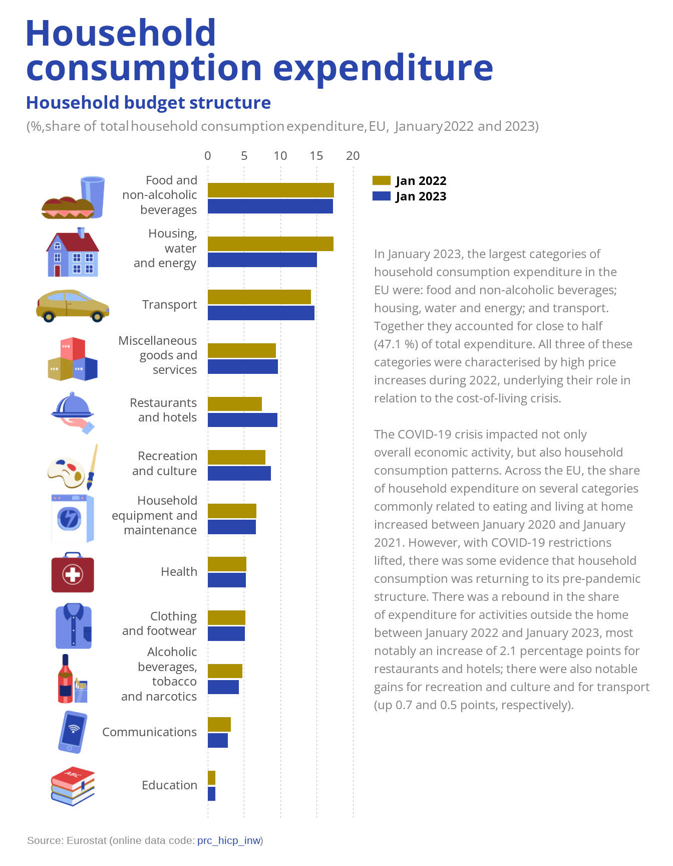
Post-COVID Wallet Woes: The High Cost of Living
COVID-19 had a major impact on the economy and effectively affected the consumption patterns of European households.
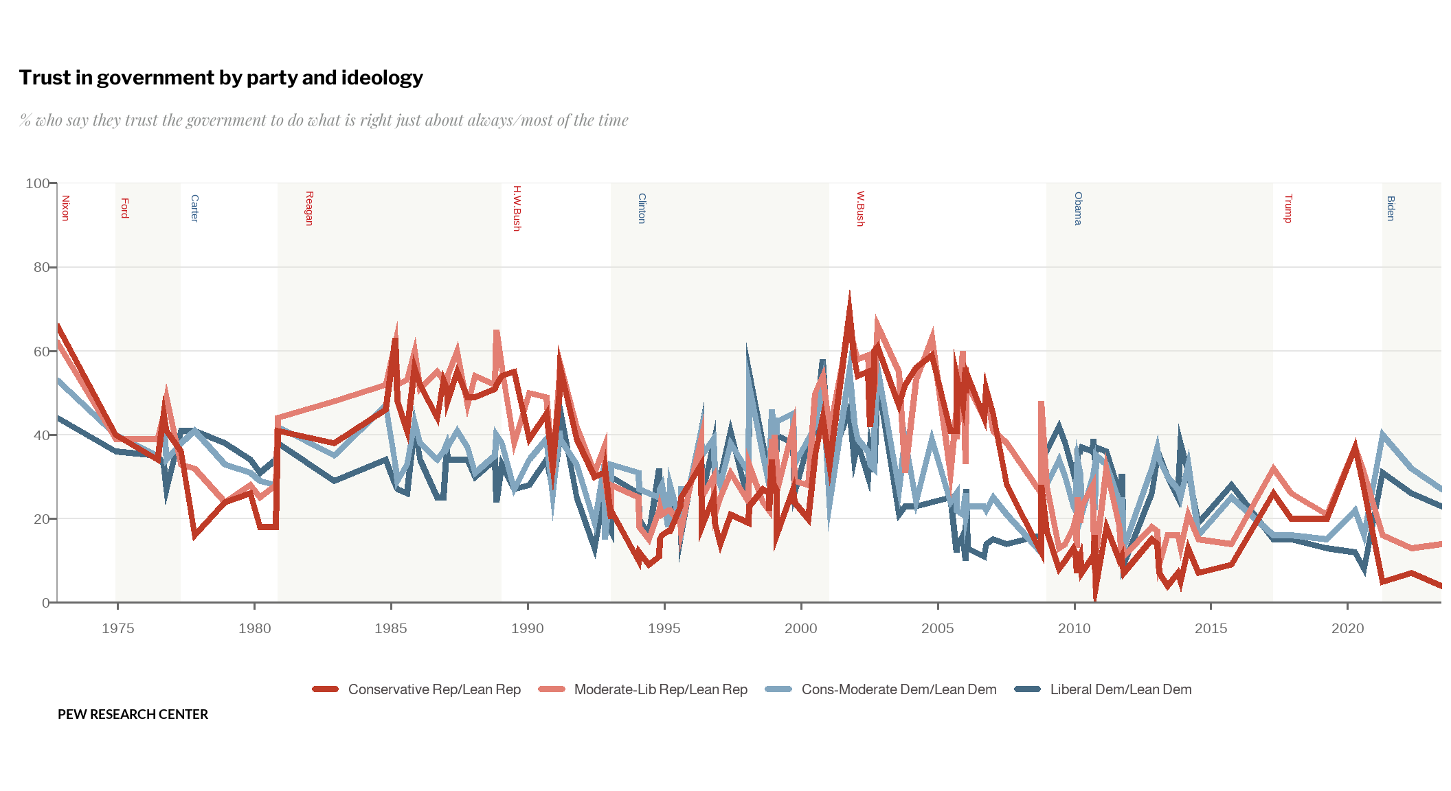
Public Trust in Government Hits Historic Lows
Using Pew Research data to visualize the evolution of public trust towards different U.S. governments between 1972 and 2023.

With Whom Did We Spend Our Time in 2020?
This article goes through the steps of recreating a bar chart with small multiples using the ggplot2 package in R. The original chart shows the distributions, by age, with whom we spend our time. The replication and enhanced versions include new data from the year 2020.
Life Expectancy Increased in All Countries of the World
The aim of this project is to reproduce, layer by layer, a chart on Life Expectancy evolution from Our World in Data.
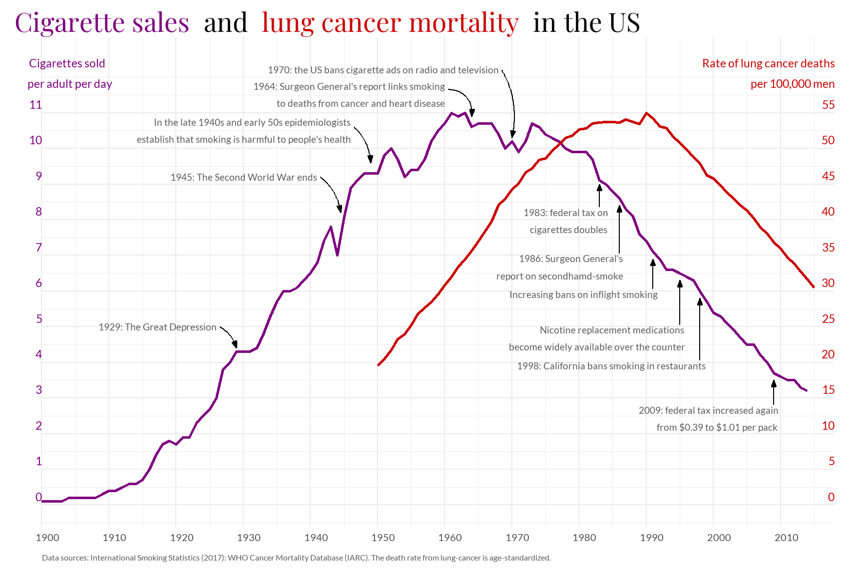
Cigarettes Sales and Lung Cancer Mortality in the US
Every year, around 8 million people die prematurely as a result of smoking. In this case, examining the relationship across the cigarettes sales in men in the United States.
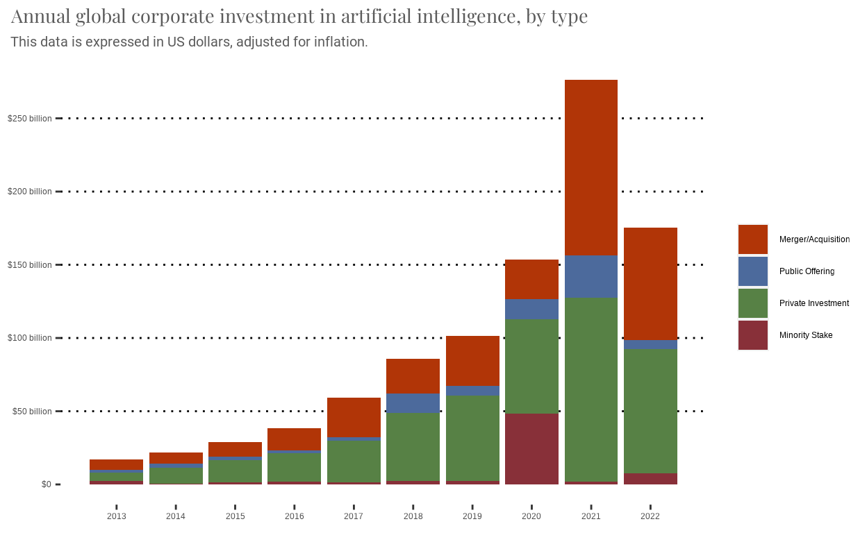
Annual Global Corporate Investment in AI by Type
This project replicates a graph from Our World in Data and proposes an improvement.
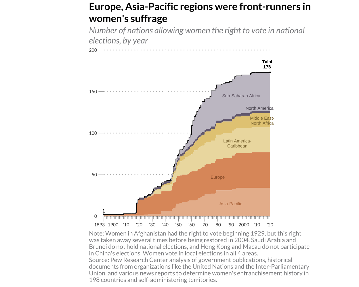
Women's Suffrage Across Time
The recreation of a graph illustrating the development of the women's suffrage movement throughout the years.This graph is replicated and then improved by adding data describing the development of women's political participation.
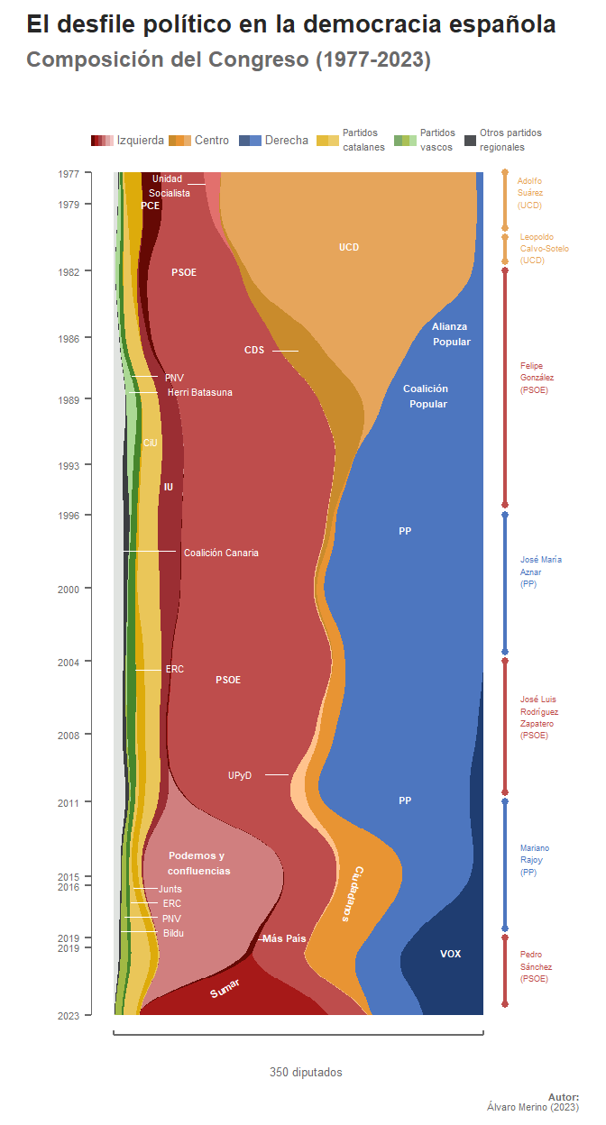
Bipartisanship Unveiled: The Evolution of Recent History in the Spanish Congress
Replication and alternative rendition of a streamgraph sourced from El Orden Mundial, utilizing data on congressional deputies available on the official website of the Spanish Congress.
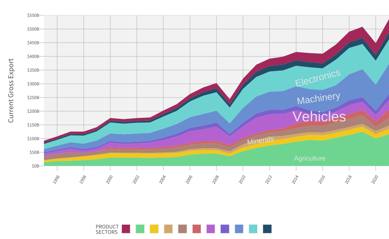
Mexico's Export Dynamics from 1996 to 2020 by Sector
Replication and alternative version of the over time graph sector exports of Mexico by the Growth Lab at Harvard University.
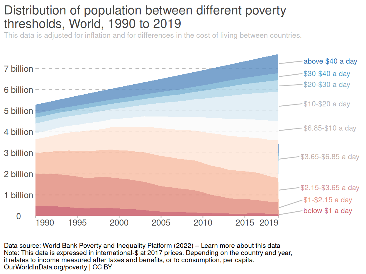
The Phenomenon of Poverty
Visualizing the global distribution of disposable income between 1990 and 2019- Our World in Data.
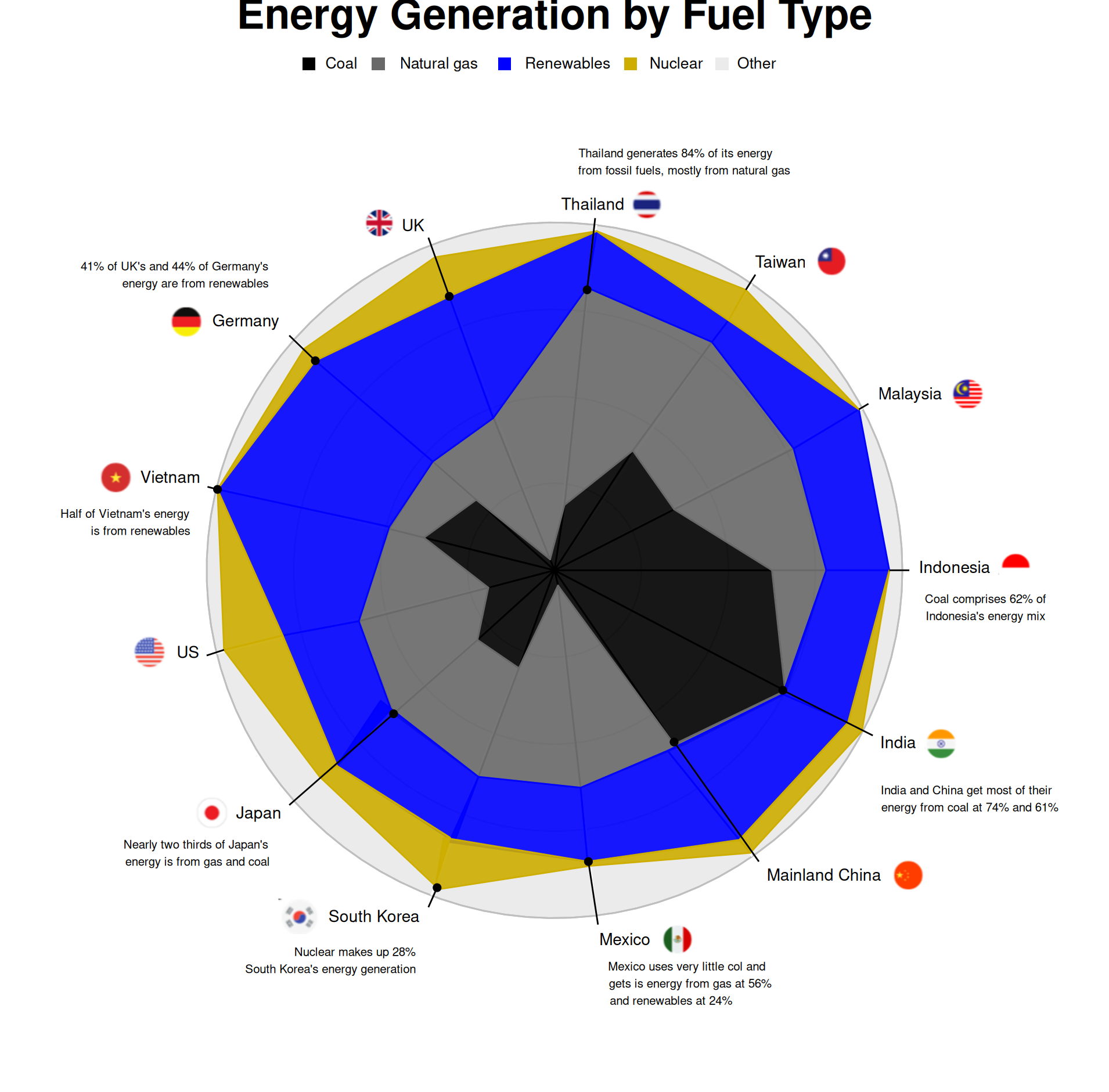
Energy Generation by Fuel Type
Using the Energy Institute’s data to reproduce Bloomberg’s chart and to provide an alternative representation.
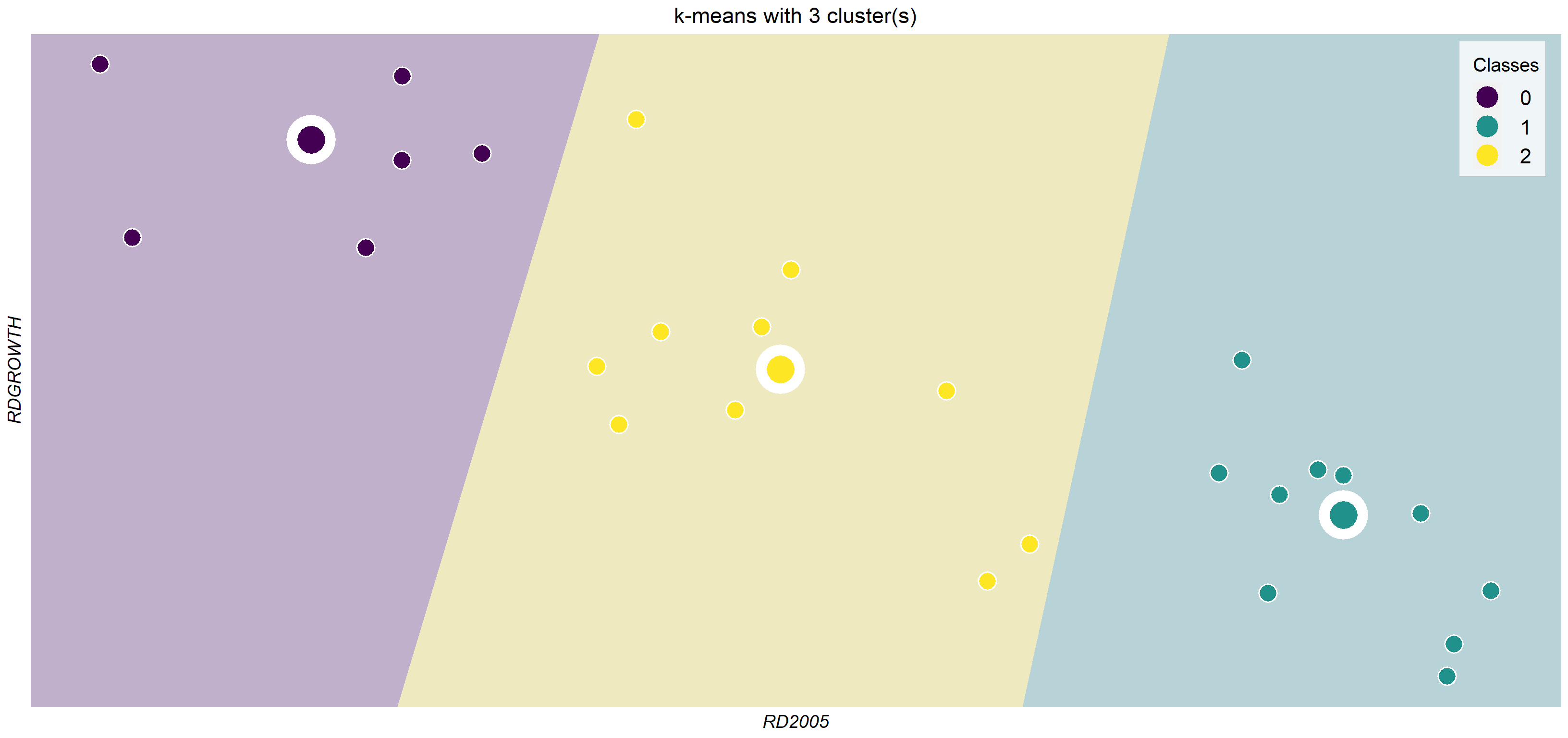
Club Convergence Graphs
Visual representation of Convergence Clubs for European countries in terms of R&D spending following KMeans and Phillips&Sul methodologies.
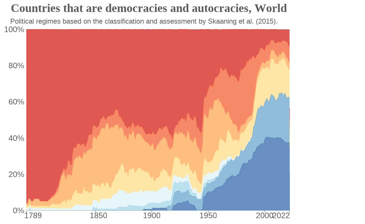
The world is progressively embracing democracy
A reproduction of the Our World in Data visualization, which is based on the classification and assessment of countries' political regimes by Skaaning et al. (2015).
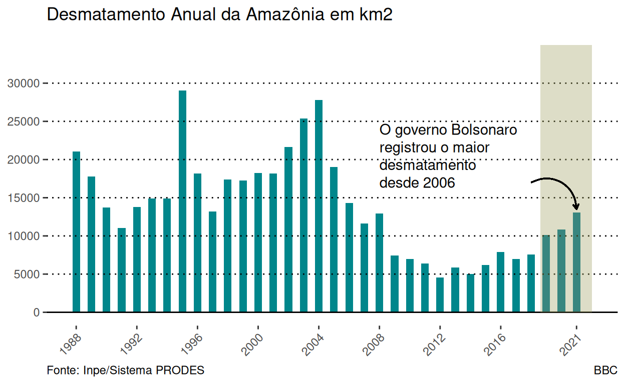
What Future for Amazon - Some Lessons from the Past
Evolution of Amazon Deforestation (1988 - 2021) with Basis on Inpe - Sistema PRODES Data.
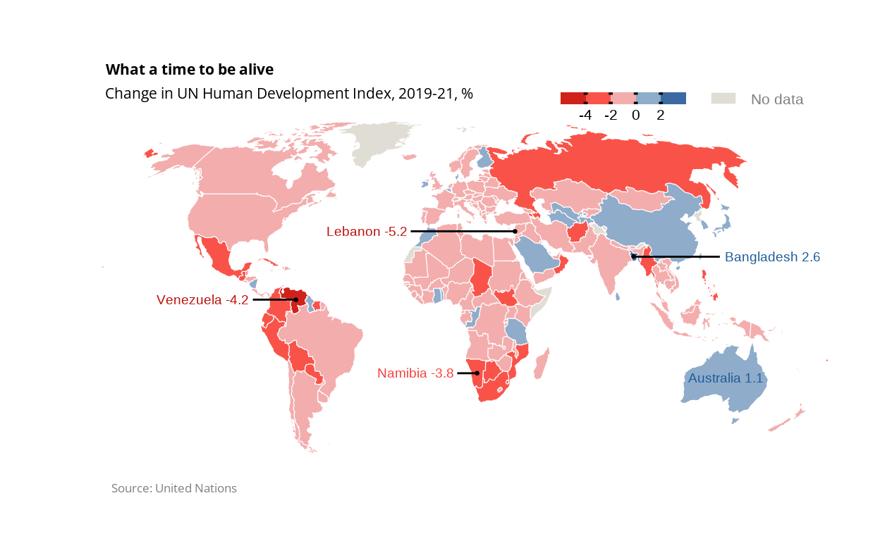
HDI - What a time to be alive
Using the United Nation's Human Development Index (HDI) data to produce The Economist's map and other visualizations.
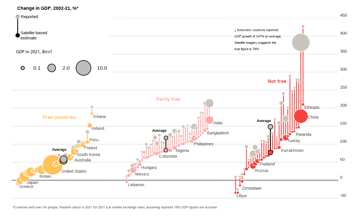
Satellite images defy economic data of authoritarian regimes
Highly customized dumbbell chart that compares official GDP against satellite-based estimation of GDP, across 103 countries.
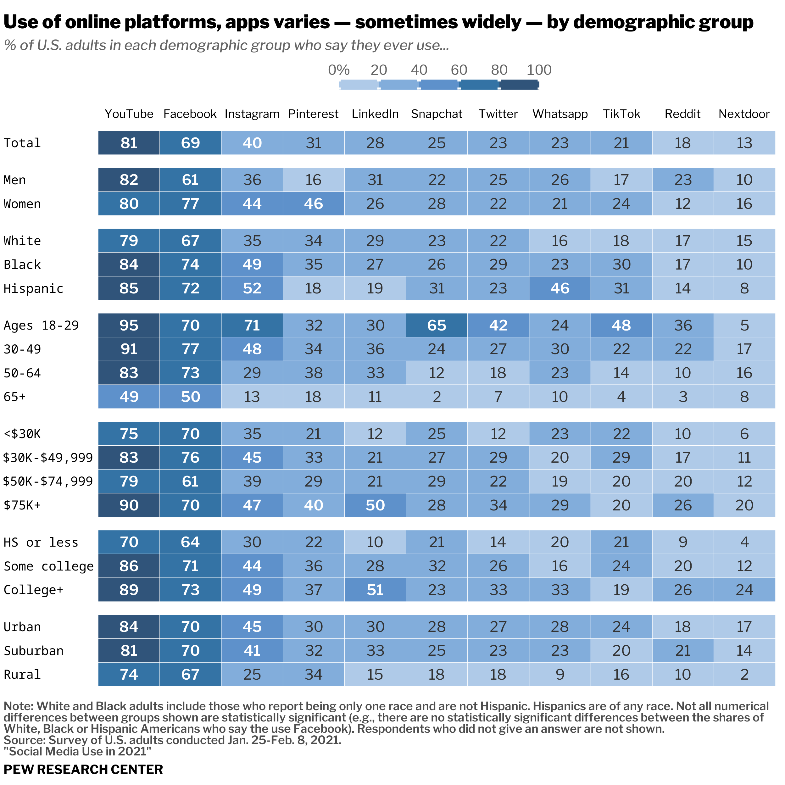
Use of Social Media Platforms in 2021 (U.S.) by Demographic Group
Replication and alternative version of a heatmap from 'Social Media Use in 2021' (Pew Research Center).
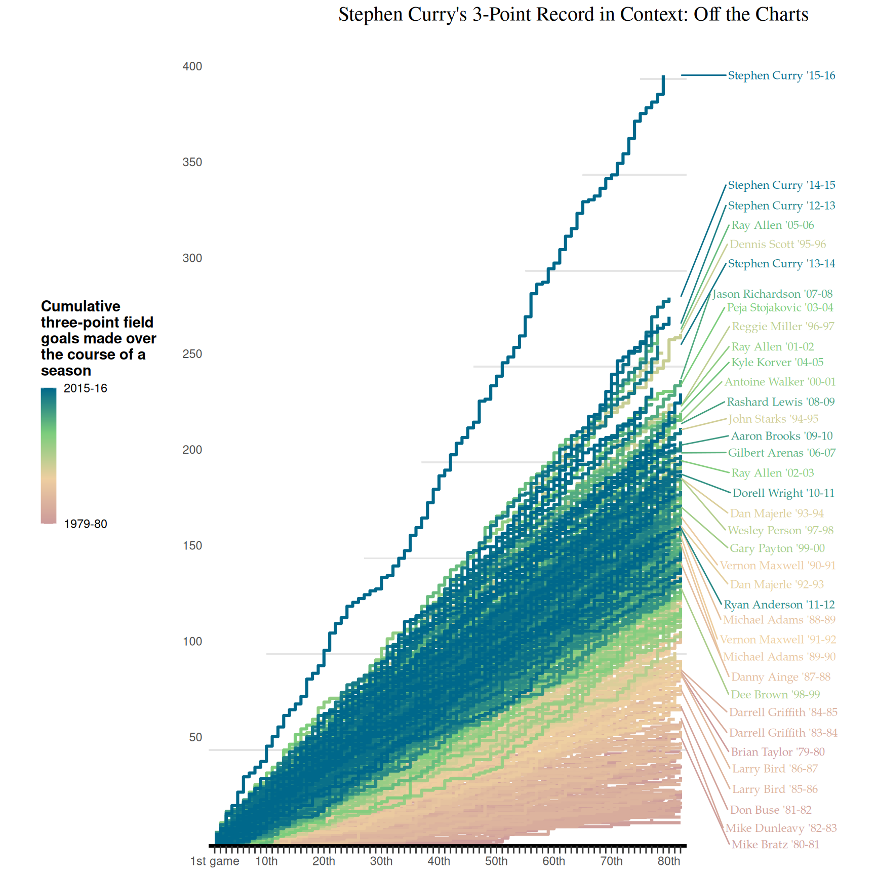
Steph Curry's 3-Point Record in Context: Off the Charts
In this project, I will explain how to replicate a graph of the three-point field goals made over the course of a season for every player in a range of time. The graph shows a relevant difference in cumulative sums between the current seasons and the previous ones. First, I will clean the dataset according to the variables that I need. Second, I will present step by step how to reproduce the graph using ggplot2 package.
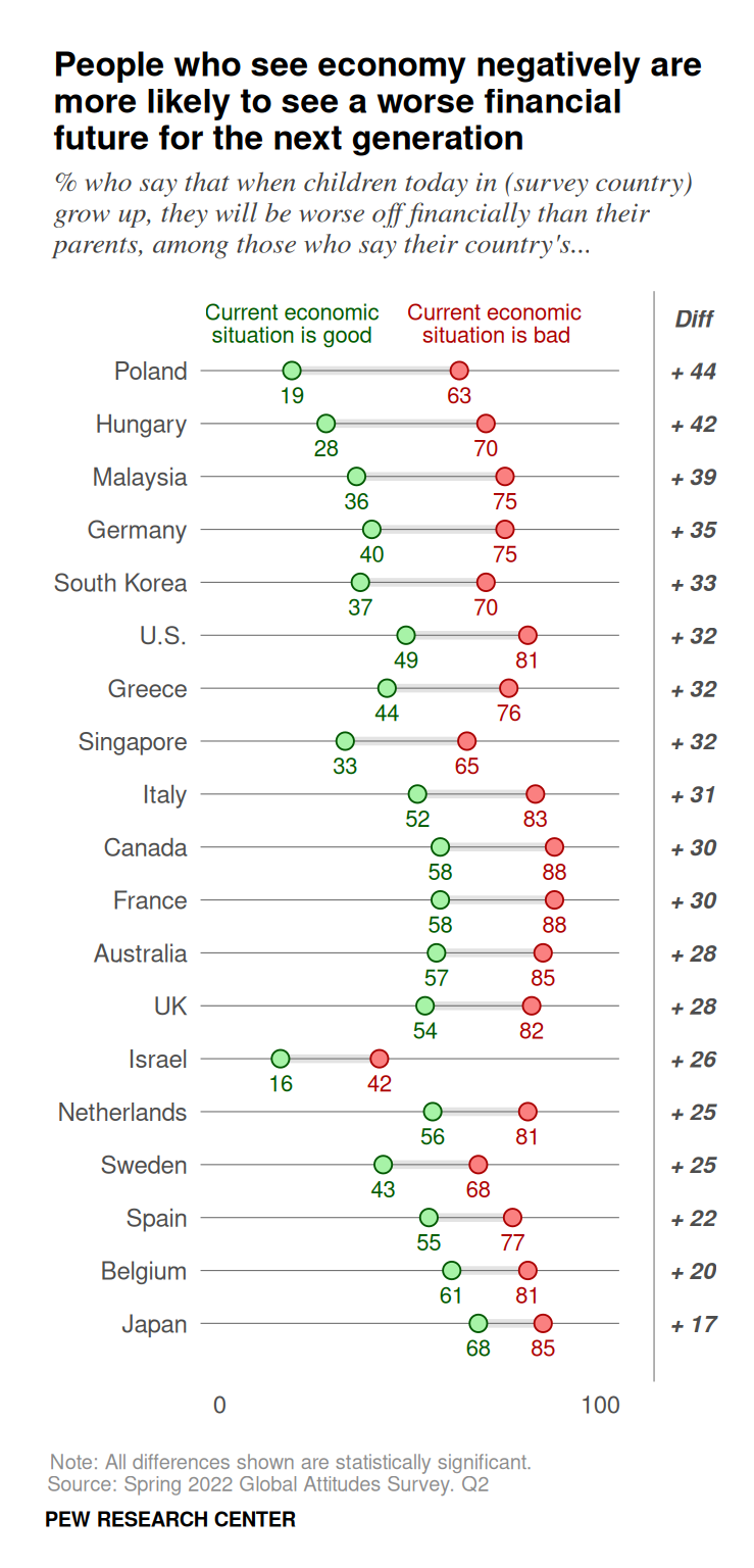
Views on Financial Well-Being of Future Generations
In this post I recreate a Pew Research graph and propose an alternative visualization of the data.
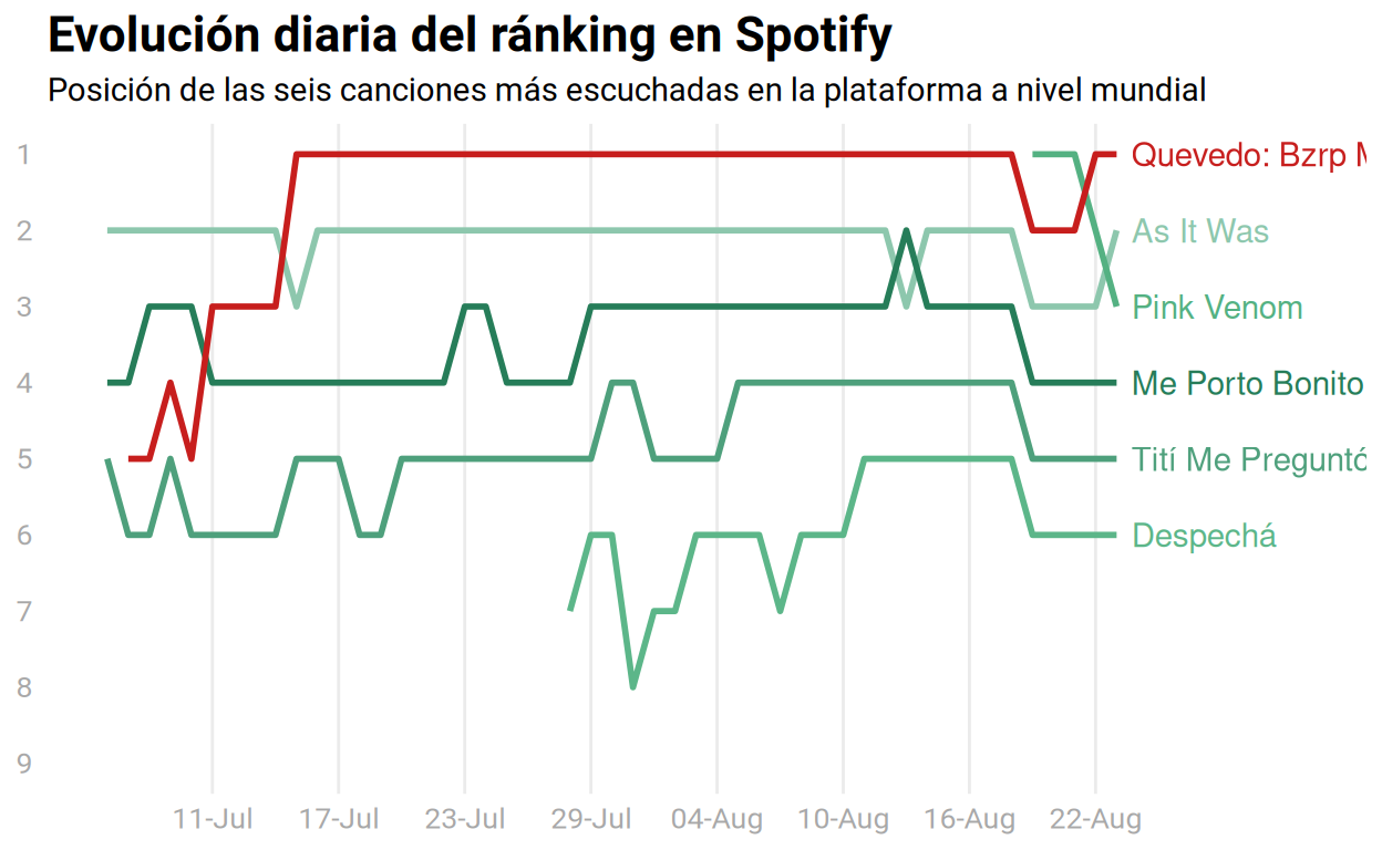
Worldwide Top 10 Listened Songs in Spotify
This project is about a visualization of the ten most listened songs between June and August 2022 in Spotify.
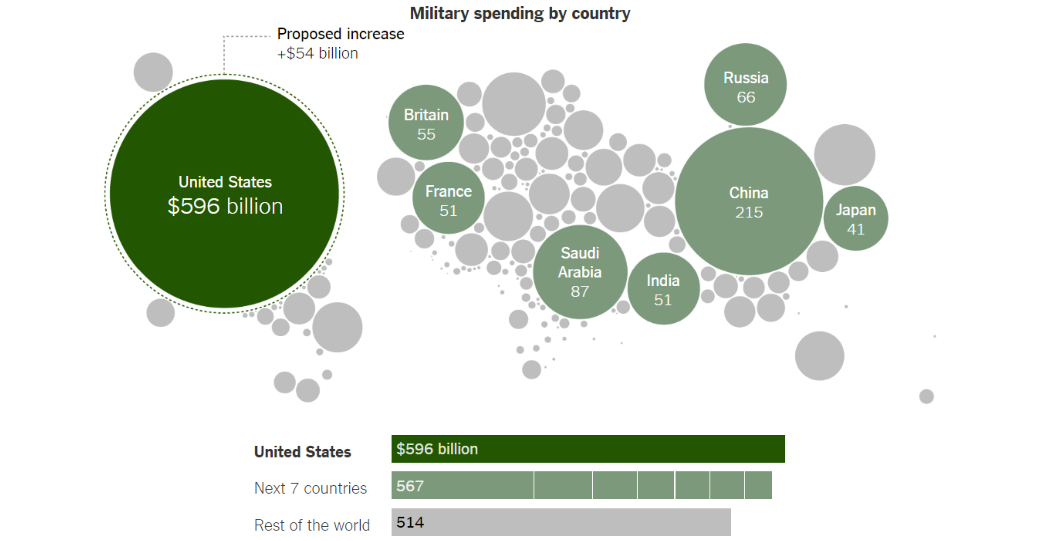
Military Spending
In this article I have a walkthrough on how to create a graph as closely as possible that was published by the New York Times with ggplot2, but is it graph or a map paste(graph,map); it is both. It shows the country military spending in respect to the geolocation of the country.
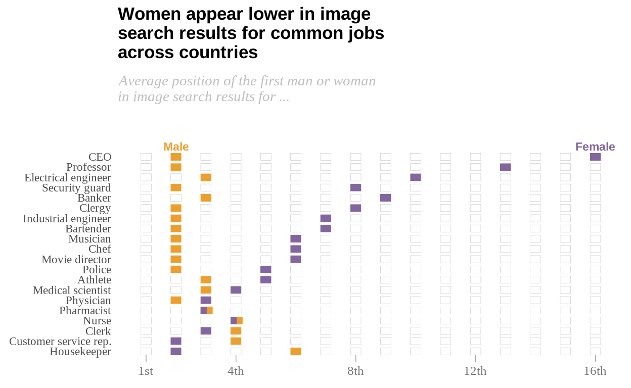
Searches of common jobs: women tends to appear lower than men
A replication of the graph made by Pew Research Center about the topic and another proposal.
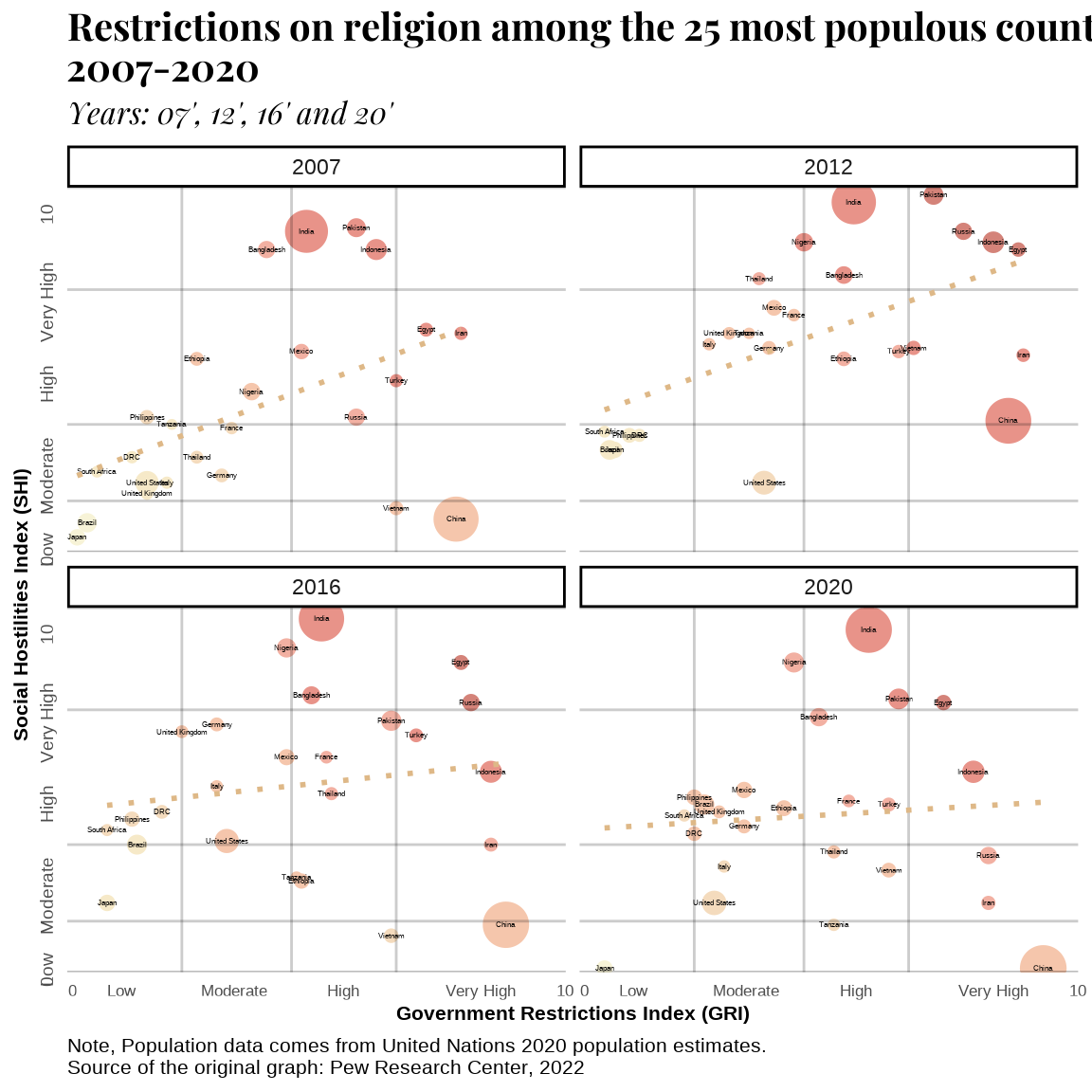
Restrictions on religion among the most populated countries across time
A replication of a graph from Pew Research Center on the restrictions on religion among the 25 most populous countries.
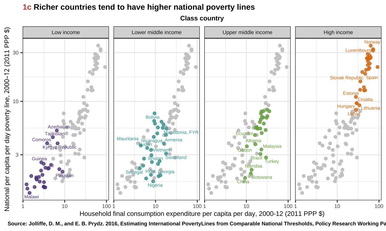
The World Bank's Richer Countries Tend to Have Higher National Poverty Lines Chart
The aim of this project is to recreate and improve a chart from the first Atlas of Sustainable Development Goals.
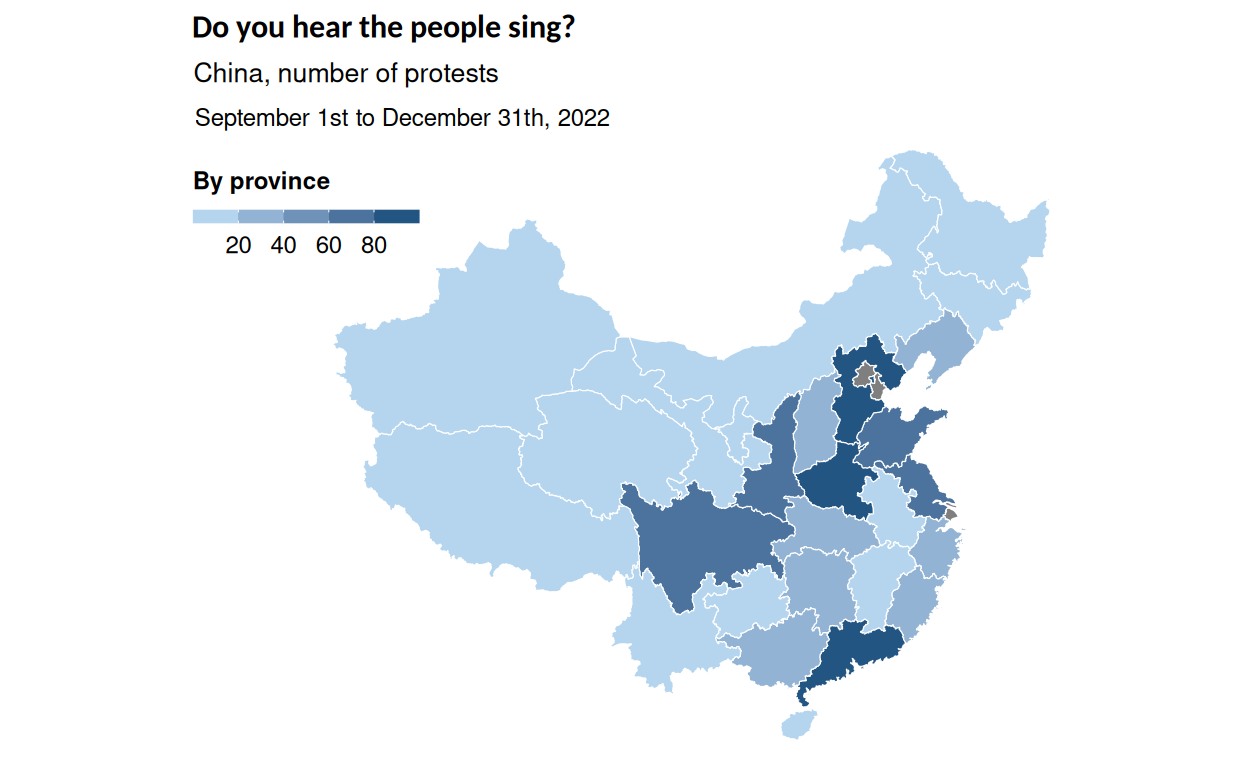
Social Dissent in China by ‘The Economist’: How Frequent are Protests in the Country?
An explanation of my layer-by-layer construction of a chart representing social dissent in China geospatially and by issue. This article consists in the replication of a plot made by The Economist's, continuing with an alternative representation using similar data. The critique of the strengths and weaknesses of the original chart and the successive transformations of the chart are fundamented in data visualization theory.
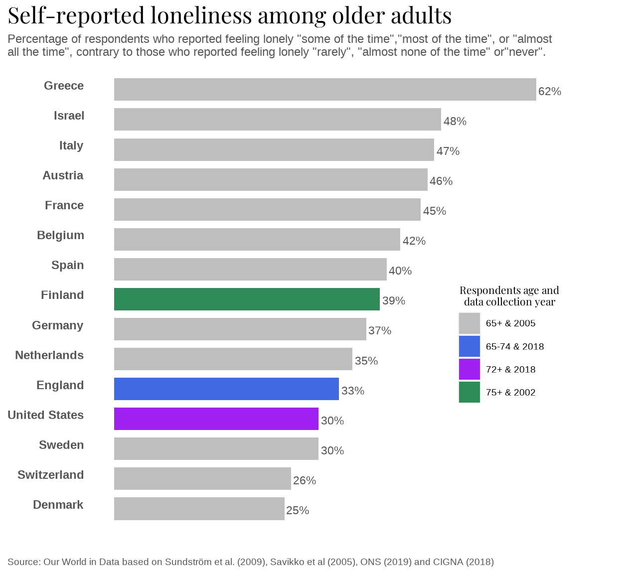
Percentage of elders feeling lonely
Visualizing and comparing loneliness percentage among elders between different countries, through barplots and maps.
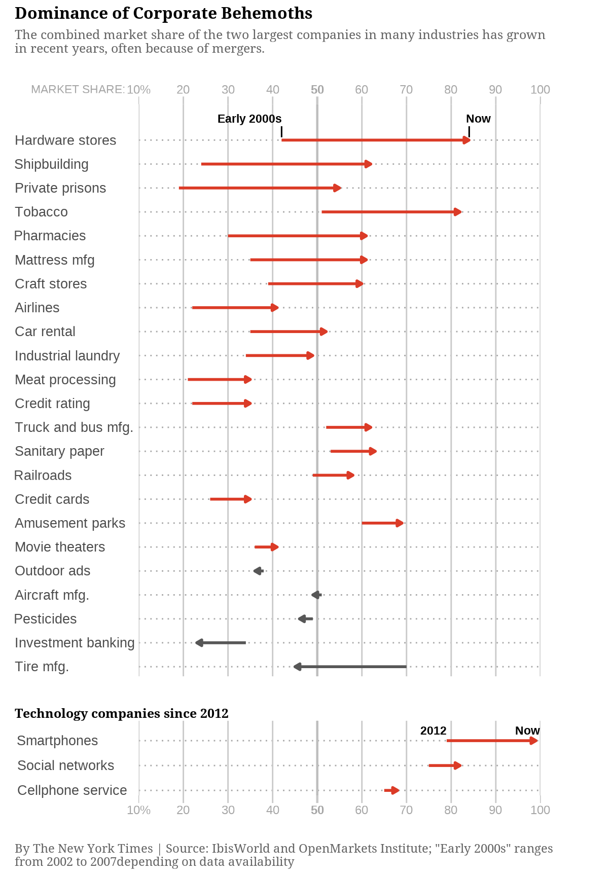
New York Times market share graph
In this article I explain how I replicated a New York Times chart in R and the process of creating a different chart with ggplot2 with the same data. I'll also explain the limitations of replication and alternative visualization, and discuss the strengths and weaknesses of both charts, based on data visualization theory.
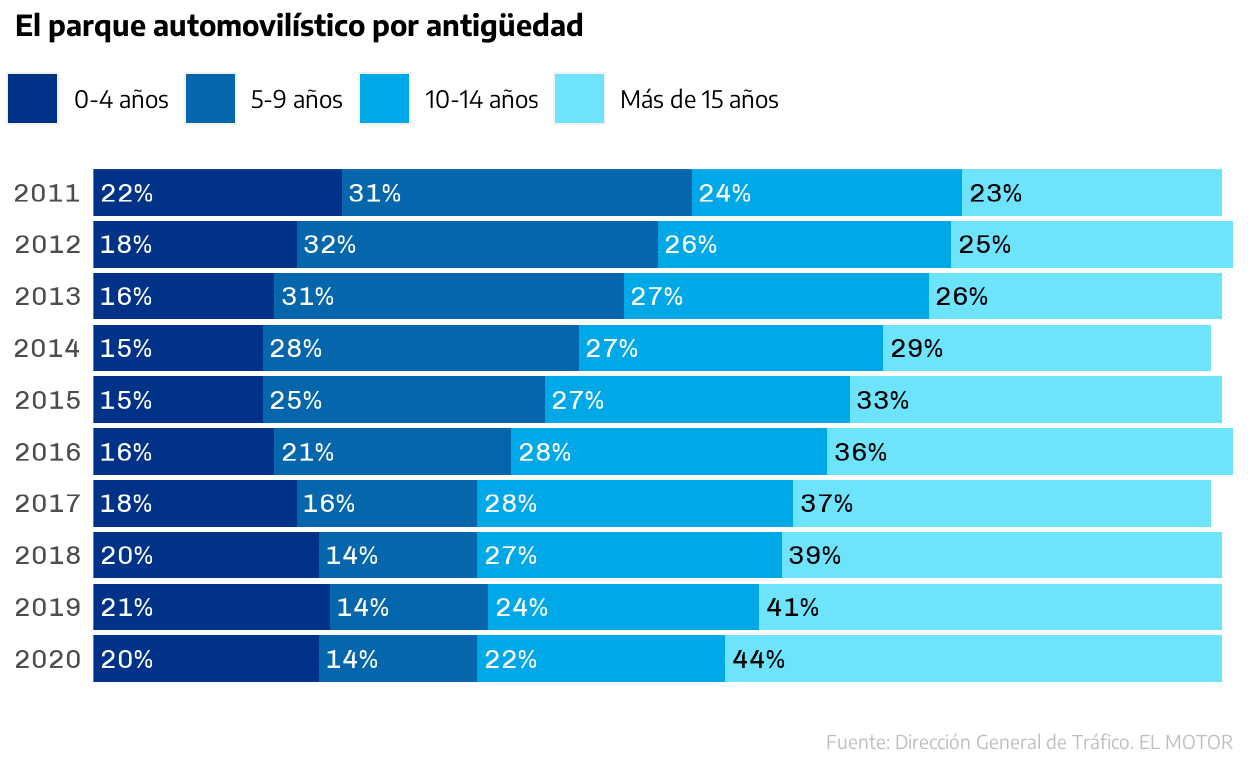
Car fleet by antiquity in Spain
Car accident rate is directly related to the antigüity of the vehicle. The graph represents car fleet and its age along 10 years. I will replicate it as closely as possible, as weel as providing a visualization alternative.
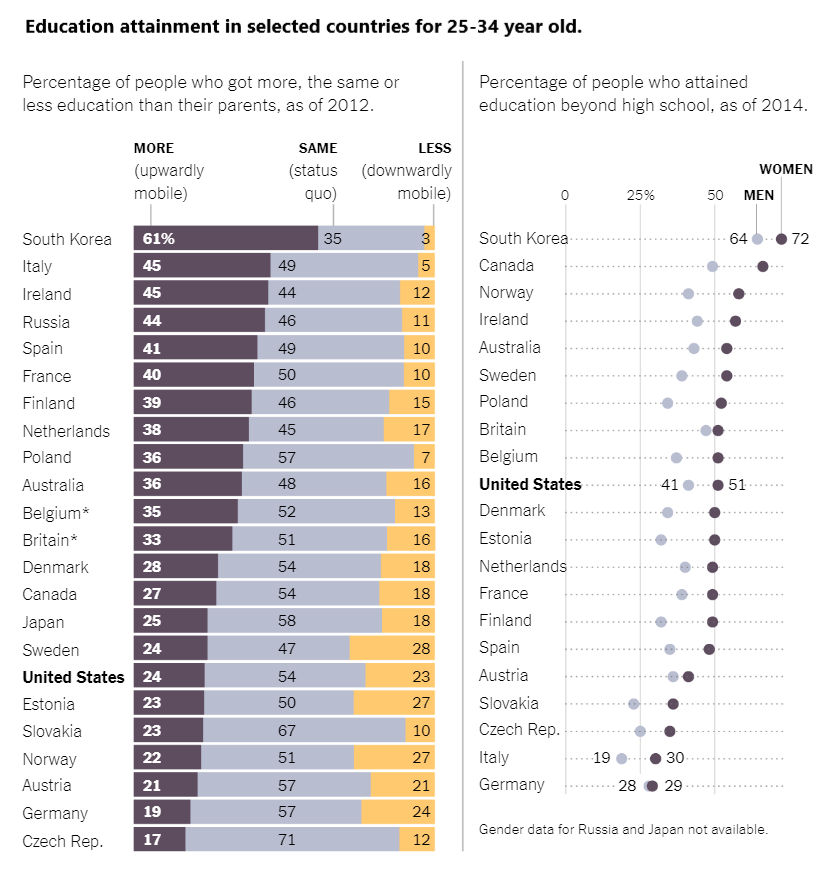
Education Attainment Graph
This project consists in the replicaion and alternative representation of a graph from a New York Times article called "Where Education Drives Mobility".
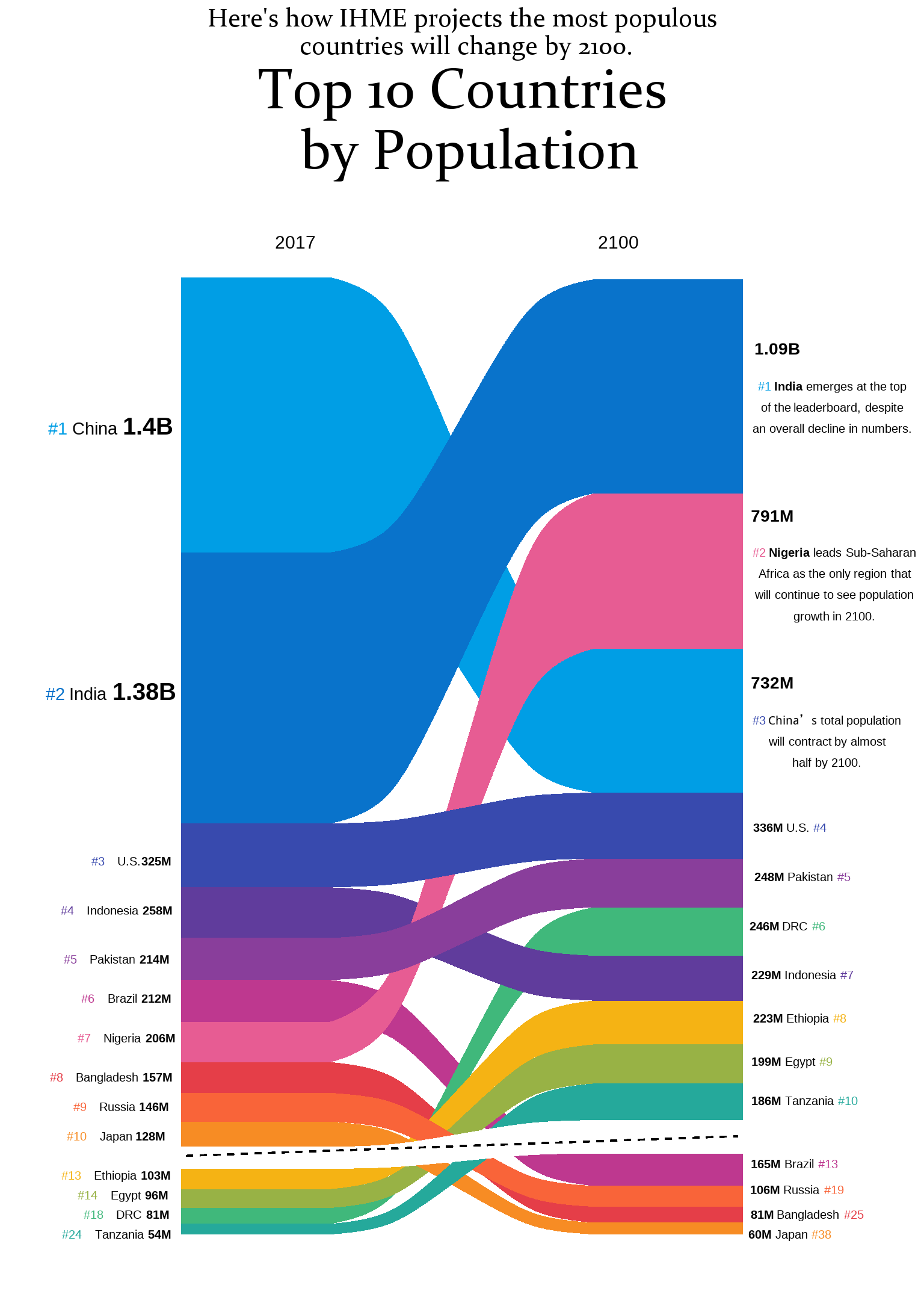
Population Perspectives
A graph about population in 2017 and 2100 will be replicated and an alternative way of visualizing this graph will be presented.
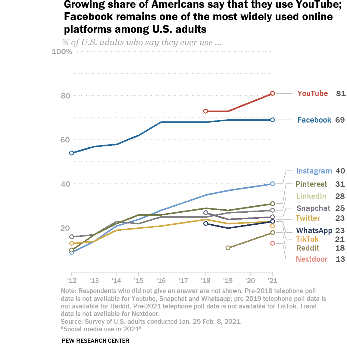
Social Media Use in 2021
Social Media Use evolution in the USA for 11 major platforms: step-by-step replication of the graph, possible enhancements and alternative visualization.
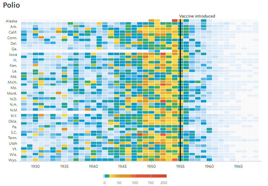
Effect of the introduction of the polio vaccine in the US
This project has two purposes: to reproduce the plot published in 2015 in the Wall Street Journal article 'Battling Infectious Diseases in the 20th Century: The Impact of Vaccines', and to propose an improved visualization.
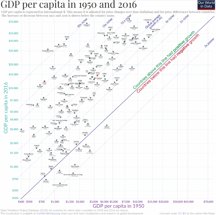
Country Convergence
This project enables the user to recreate a specific graph in OurWorldinData on GDP per capita layer by layer. It also introduces two alternative representations resorting to the same data.
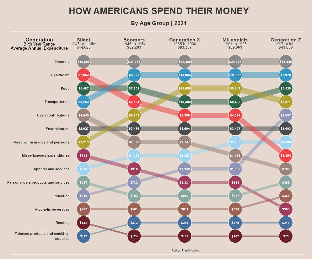
Bump chart: How Americans spend their money
Code to replicate the graph in `ggplot2` and some improvements.
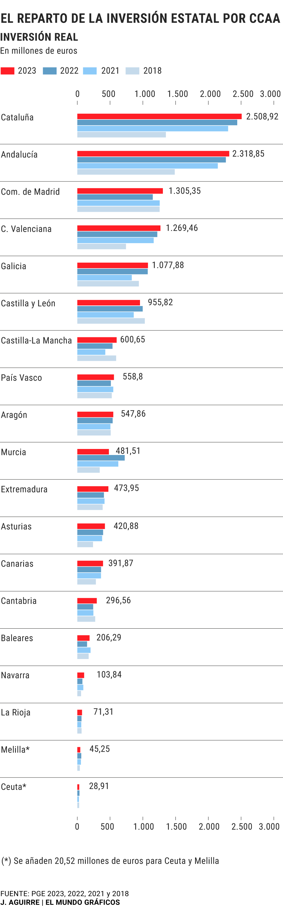
Distribution of state investment by autonomous communities
This following page is a guide, of how to reproduce step by step, the plot of "El Mundo Gráficos" done by the student Pablo Arroyo as a final project for the subject.
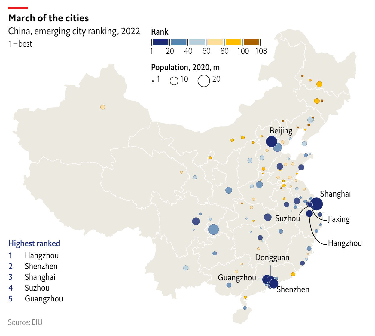
GDP Forecasts for China's Cities by 'The Economist': Coastal Areas Have the Highest Growth Potential
A layer-by-layer construction of a map of China containing information on forecasted GDP growth and population for over 100 cities.
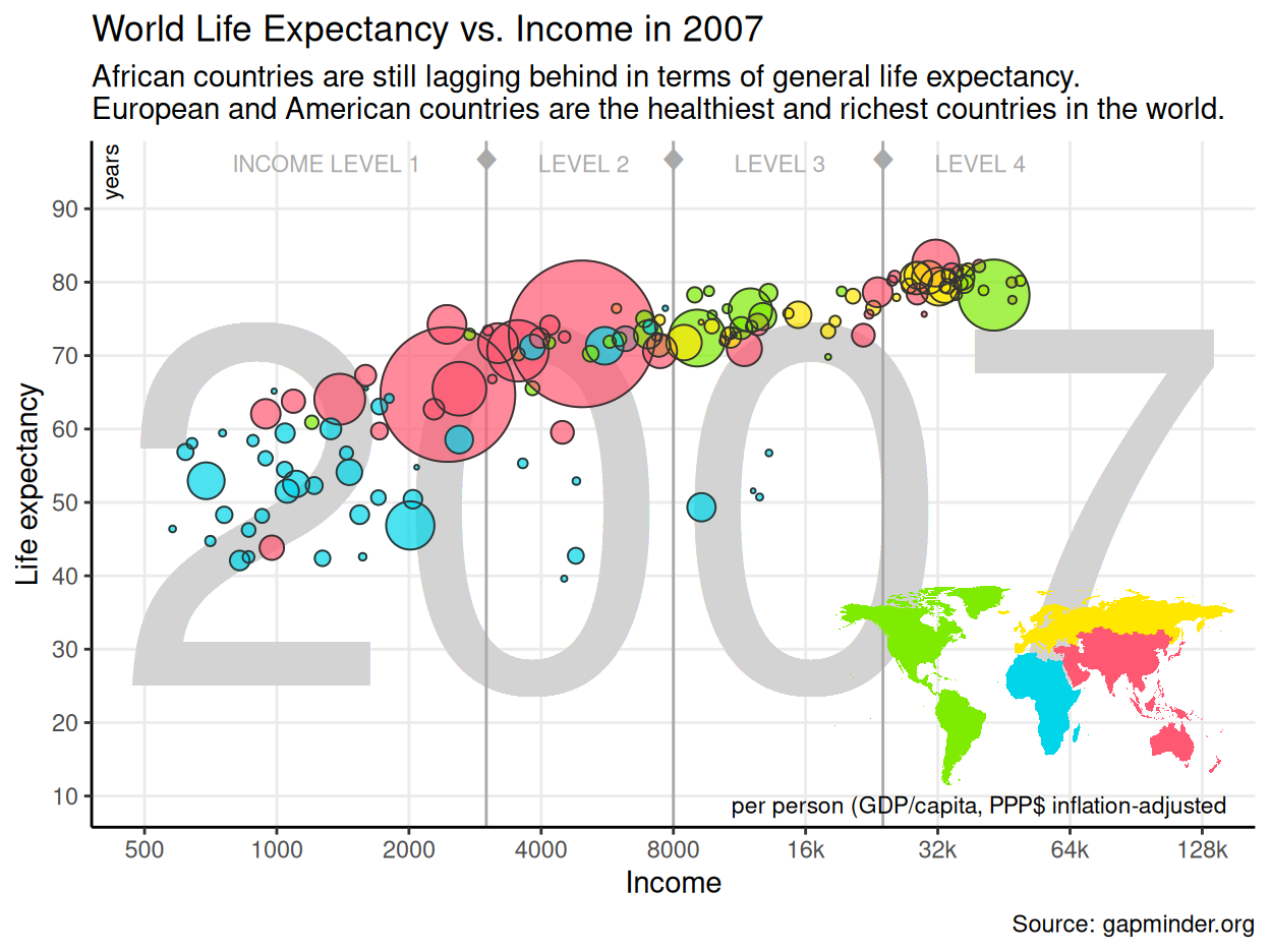
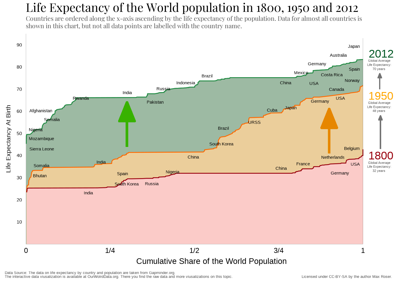
Gapminder's World Health Chart
This tutorial reproduces one of the most popular data visualizations ever and serves as an example project for this course
